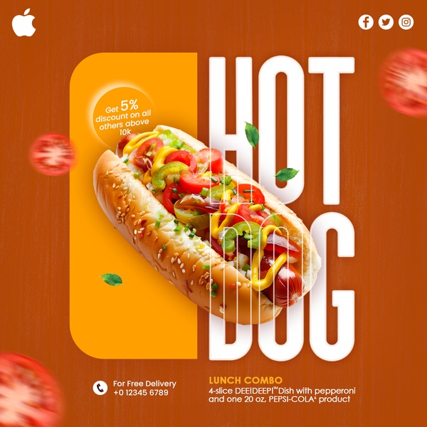
A high-contrast advertisement featuring a hot dog combo meal with a direct 5% discount offer.
Free credits included. No card required
This hot dog advertisement utilizes a high-contrast color palette and bold, floating text to command immediate attention. By anchoring the creative on a clear value proposition like a 5% discount, the brand successfully leverages direct-response triggers that prioritize immediate conversions over complex storytelling.
For most food businesses, this structure works because it removes friction by immediately identifying the product and the offer. Using Promer AI, you can replicate this visual hierarchy to ensure that your own unique promotions stand out against the high-frequency feed fatigue typical of social platforms.
A winning advertisement is built on the foundation of a clear, high-value offer supported by a visual structure that directs the eye exactly where you want it to land.
Pro tip
When using high-contrast colors like orange and white, ensure your product photography remains the brightest element in the frame. This draws the viewer's eye immediately to the center, reinforcing the connection between the offer and the food.











Promer helps you find the pattern, adapt it to your product, and create your own version in minutes.






