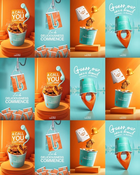
A creative series using surreal, playful photography to highlight a fried chicken brand with vibrant orange and teal color blocking.
Free credits included. No card required
The use of bold color contrast and surreal object placement makes this fried chicken ad stand out in a busy feed by triggering visual curiosity. By decoupling the product from its traditional plating and placing it in an abstract, gravity-defying environment, the ad forces the viewer to pause and decode the scene. This Promer AI approach ensures that your brand message is delivered through an engaging narrative rather than a standard product shot. Using high-contrast color palettes like orange and teal typically improves thumb-stop rates by creating a distinct visual signature that remains consistent across your campaign iterations.
Great ads start from an idea, a feeling, or a structure, not a blank design.
Pro tip
When utilizing surrealism, ensure the core product remains the visual hero of the scene to avoid customer confusion. Pair this technique with a clear, benefit-driven headline to ensure that the visual curiosity translates directly into a desire for the food.




















Promer helps you find the pattern, adapt it to your product, and create your own version in minutes.






