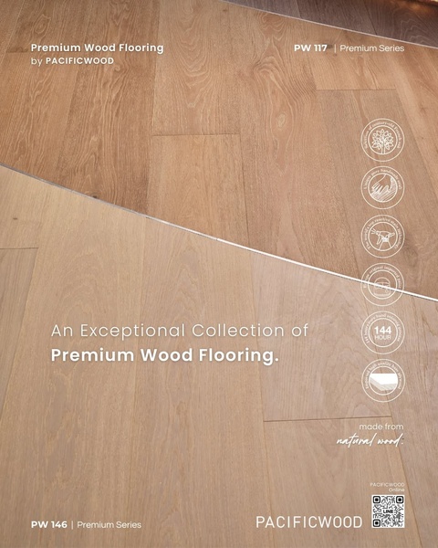
This ad creative features a side-by-side comparison of different wood flooring textures with detailed technical attribute icons for each series.
Free credits included. No card required
The effectiveness of this wood flooring ad creative stems from its clear use of visual hierarchies to communicate technical quality. By pairing a high-resolution, split-view texture comparison with specific, benefit-driven icons, the ad quickly establishes credibility and allows the viewer to immediately assess the material quality. This structural clarity removes ambiguity for the consumer, making it easier to visualize the product in their own space without relying on excessive marketing jargon.
For most performance teams, this approach works because it mimics an "in-store" experience where texture and specifications are the primary drivers of purchase decisions. By using Promer AI to maintain this level of visual consistency, brands can effectively scale high-intent ad variations while ensuring the core product attributes remain the centerpiece of the user experience.
Great ads start from a structured visual hierarchy that prioritizes the user's need for product quality over abstract lifestyle marketing.
Pro tip
When using a split-screen or comparative hook, ensure that the textures being shown provide enough contrast to emphasize the distinct value of each series. Keep your technical icons consistent across your entire collection to help customers build a mental model of your brand's standards, regardless of which specific product they are currently viewing.

















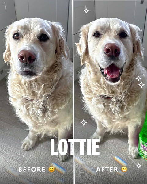


Promer helps you find the pattern, adapt it to your product, and create your own version in minutes.






