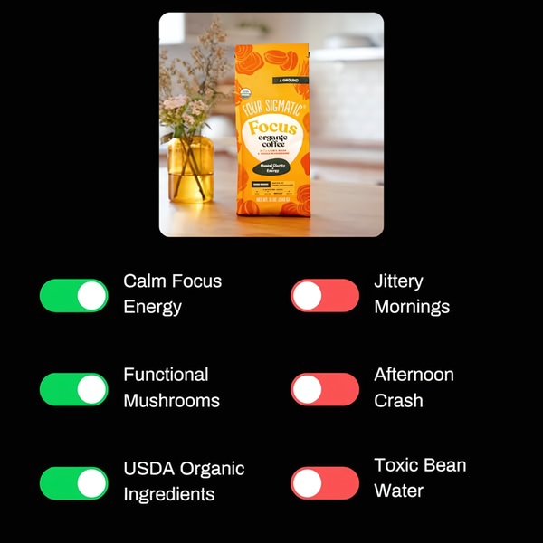
A square ad format featuring a Four Sigmatic coffee bag next to a clean toggle-style checklist that visually contrasts positive outcomes with common pain points.
Free credits included. No card required
This organic coffee ad creative succeeds by using a comparative visual hook that immediately contrasts desired outcomes with common industry frustrations. By organizing product benefits into a binary toggle-switch format, the ad makes the value proposition instantly scannable for the viewer. This structure respects the user's limited time while building immediate intellectual trust in the functional claims of the product.
This specific layout works because it functions as an objective check-list, allowing users to mentally self-select into the desired positive state. Using Promer AI to analyze how your own product benefits contrast with typical market problems can help you replicate this objective tone for your audience. In most cases, this clear, low-friction visualization helps move a cold audience from intrigue to intent faster than feature-heavy long-form copy.
Great ads start from an idea, a feeling, or a structure, not a blank design.
Pro tip
The power of this layout lies in its honesty; ensure your 'negative' column addresses actual, relatable pain points that your audience struggles with daily. Avoid generic industry terms and instead use specific, emotional language that speaks directly to the user's morning experience.












Promer helps you find the pattern, adapt it to your product, and create your own version in minutes.






