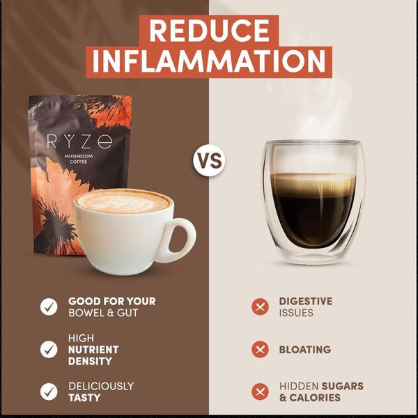
A high-contrast 1:1 image featuring a side-by-side comparison of mushroom coffee against standard black coffee to clearly illustrate health advantages.

Mushroom Coffee Split-Screen Comparison

A high-contrast 1:1 image featuring a side-by-side comparison of mushroom coffee against standard black coffee to clearly illustrate health advantages.

Ad Details
Style
Us and Them
Format
1:1
Industry
Coffee
Platforms
Instagram Feed · Facebook Feed
Language
English
  • Coffee
  • Mushroom Coffee
  • Split-screen
  • Minimalist
  • 1:1
Clone this ad with AI

Free credits included. No card required

Why this ad works

This mushroom coffee ad creative utilizes a clear 'Us vs Them' comparison to instantly highlight the unique value proposition of the product versus standard alternatives. By splitting the frame into a warm, inviting brand side and a sterile, problematic competitor side, the visual hierarchy immediately directs the viewer's focus to the health benefits being offered. Using a binary comparison is highly effective because it simplifies complex nutritional decisions into an intuitive choice for the potential customer.

Performance teams often struggle to articulate why their product is superior without sounding overly promotional, but this pattern makes the argument through a clean, factual-looking lens. You can use Promer AI to analyze the performance of this layout and adapt the structure for your own product categories. When properly executed, this type of creative helps isolate specific customer pain points—such as bloating or digestive issues—and frames the solution as the logical next step.

The winning ingredients

  • Split-Screen Architecture The 1:1 ratio uses a vertical divider to create an immediate mental separation between the healthy solution and the standard alternative.
  • Direct Benefit Mapping Each product feature on the left is matched against a common pain point on the right using clear checkmark and 'x' iconography.
  • High-Contrast Visuals The use of contrasting brown and beige backgrounds anchors the brand imagery, ensuring the subject is the focal point of the ad.
Great ads start from a clear structure that makes the buyer's choice feel effortless, not just a design that looks good.

How to make it yours

  1. Start your project using AI Ad Clone to import the layout structure that makes this split-screen comparison work effectively.
  2. Input your product URL so that your specific product imagery, brand color palette, and logo are automatically integrated into the comparison frame.
  3. Refine the copy to highlight your unique features against the specific pain points your customers face, then generate variations in the 1:1 format.

Pro tip

When building comparison ads, avoid making the 'them' side look too much like a real-world competitor to prevent potential legal or platform flagging. Focus on the category pain points—like 'bloating' or 'jitters'—rather than specifically naming or targeting other brands.
Storage Ottoman Feature Callout Ad
Minimalist Storage Ottoman Lifestyle Showcase
Macmillan Coffee Morning Fundraising Ad
Minimalist Storage Ottoman Reveal
World Bicycle Day Coffee Brand Campaign
Coastal Outdoor Sofa Hero Shot
Aspirational Outdoor Patio Furniture Setup
Outdoor Sofa Lifestyle Ad
Outdoor Coffee Table Lifestyle Ad
Minimalist Book Stack Creative
Storage Ottoman Functional Lifestyle Ad
Nightstand Organization Ad
Storage Ottoman Lifestyle Ad
Aspirational Ottoman Living Room Setup
Vida a l'aire lliure Outdoor Living
Outdoor Furniture Editorial Lookbook
Rugged Outdoor Espresso
Authentic Campsite POV
Matcha Latte Us-Versus-Them Comparison
Designer Look Outdoor Coffee Table Ad

Your next winning adis already out there.

Promer helps you find the pattern, adapt it to your product, and create your own version in minutes.


Free credits included
No credit card required
Ship in minutes.
Create your first ad free
Mushroom Coffee vs Regular Coffee - Comparison Ad