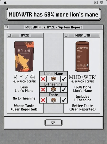
A side-by-side comparison chart styled as a retro computer interface to differentiate mushroom coffee brands through specific ingredient metrics.
Free credits included. No card required
This mushroom coffee ad creative leverages a retro interface comparison chart to frame the product as the superior choice through data-driven visual signals. By utilizing a nostalgic system report aesthetic, the brand cuts through modern feed clutter to anchor the reader's attention on tangible performance differences rather than generic branding.
The 'Us and Them' comparison structure effectively isolates your product's competitive advantages in a way that feels objective and non-salesy. For most e-commerce teams using Promer AI, this approach helps ground complex product benefits into a simple checklist, which typically works well for categories where consumers are actively evaluating ingredient quality.
Great ads start from a structured framework that guides the viewer's logic toward your product as the obvious, superior solution.
Pro tip
When using a comparison chart, always ensure your metrics are verifiable and user-centric. If you focus only on technical ingredients, you might miss the emotional benefits, so try adding a 'vibe' or 'benefit' row to your comparison table alongside the ingredient count.













Promer helps you find the pattern, adapt it to your product, and create your own version in minutes.






