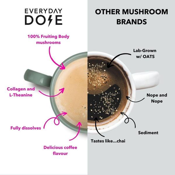
A square split-screen graphic contrasting the brand's mushroom coffee benefits against generic competitor offerings using direct labels and arrows.
Free credits included. No card required
This mushroom coffee ad creative succeeds by leveraging a clear Us vs Them visual architecture that immediately isolates product advantages against industry norms. By using a split-screen layout with contrasting neutral backgrounds, the ad forces the viewer to process a direct comparison between superior ingredients and sub-par alternatives, anchoring the value proposition in immediate product transparency.
For performance marketers, this pattern creates high-trust educational content that typically outperforms generic lifestyle imagery when targeting skeptical or new-to-market consumers. Using Promer AI to analyze these comparative layouts allows teams to replicate the structural logic—highlighting unique selling points through annotations—without the overhead of manual design for every product variation.
Effective product ads succeed by structuring clear, evidence-based comparisons that make the viewer's choice feel obvious and necessary.
Pro tip
When building comparison creatives, always prioritize the visual texture of the product itself to ground your claims in reality. If you are highlighting purity or solubility, ensure your imagery shows the final result clearly rather than just using text-heavy lists that can induce scroll-past fatigue.



Promer helps you find the pattern, adapt it to your product, and create your own version in minutes.






