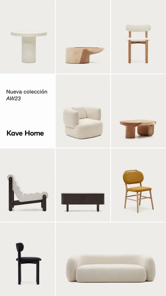
A 9:16 mobile-optimized layout showcasing a curated selection of minimalist furniture items against a consistent light background.
Free credits included. No card required
This modern furniture ad creative utilizes a highly organized grid-based layout to showcase a wide range of products without overwhelming the viewer. The strategy relies on visual consistency and negative space to establish a sophisticated, high-end brand perception immediately upon scroll-stop. By focusing on minimalist product imagery, the creative communicates quality and intentionality, which is often more effective than aggressive direct-response text for premium decor items.
For most ecommerce teams, presenting an entire collection through a single, clean frame builds authority and invites exploration. Promer AI allows you to adopt this structured catalog approach by quickly populating your own product visuals into a similar high-converting layout. This method works best when your product photography shares a consistent lighting setup and color palette, creating a cohesive visual language that appeals to design-conscious customers.
Great ads start from a visual identity that establishes trust, not just a call to action.
Pro tip
When using a grid-based creative, ensure that the most popular or 'hero' product occupies the largest or most central cell. This guides the user's eye and helps establish a clear entry point into your broader collection.
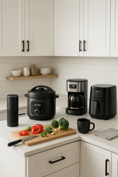


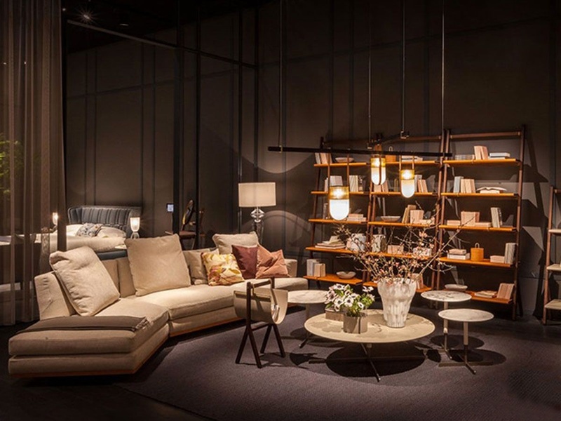
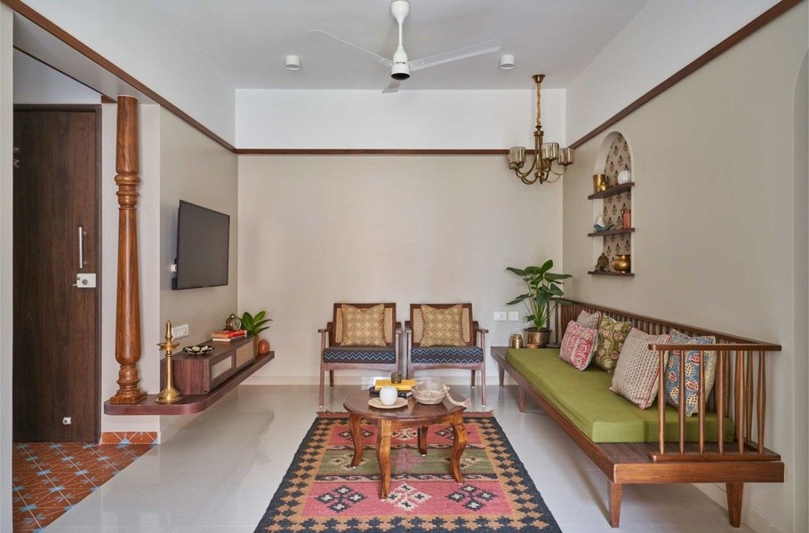
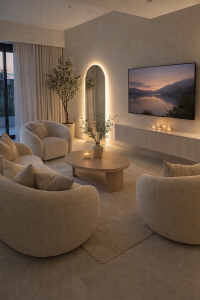
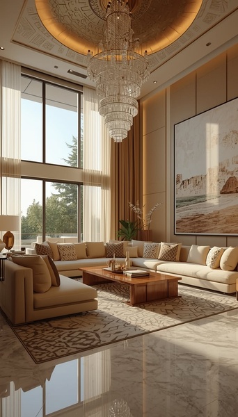
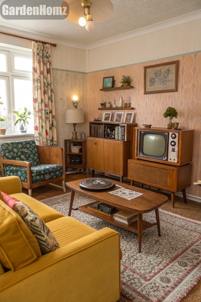



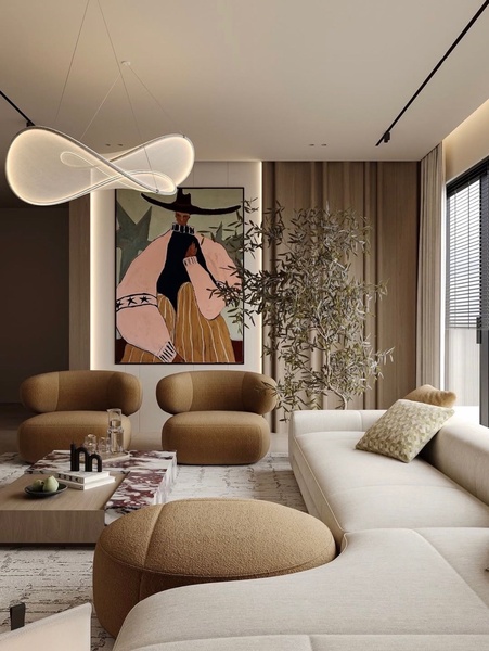
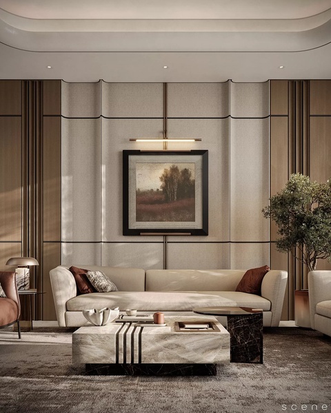
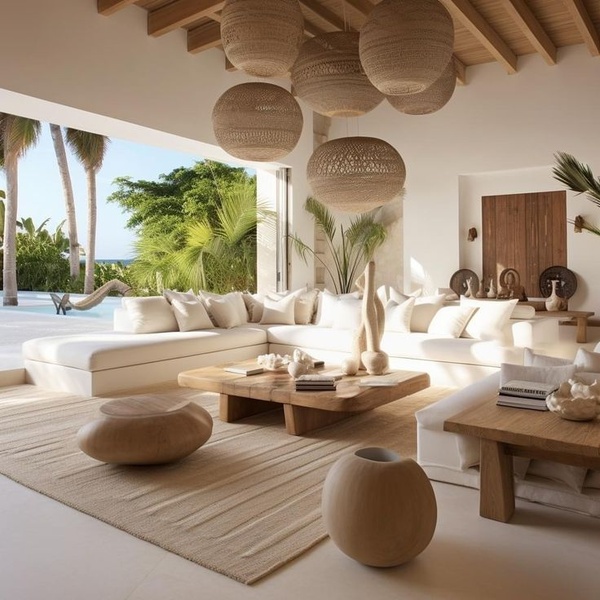
Promer helps you find the pattern, adapt it to your product, and create your own version in minutes.






