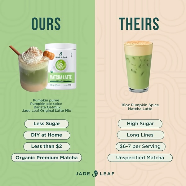
A split-screen comparison ad that contrasts the brand's DIY Matcha Latte mix against expensive, high-sugar café alternatives.
Free credits included. No card required
This Matcha Latte ad creative utilizes a clear, rational split-screen layout to instantly communicate the value of the brand's product. By contrasting the DIY, organic, and budget-friendly attributes of their mix against the negative qualities of a typical coffee shop purchase, the brand creates a compelling logical argument for immediate purchase. This visual divide forces the viewer to process information through a comparative lens, simplifying complex brand value into an obvious decision.
For most ecommerce teams, this Us-Versus-Them structure is highly effective because it directly addresses common objections like cost and health concerns. Using Promer AI, you can replicate this comparison logic by identifying the specific friction points your customers face against incumbent alternatives. When executed well, this pattern allows you to frame your product as the smarter, healthier, and more convenient choice without overcomplicating the message.
Great ads start from a clear structure that maps your customer's current frustration to your brand's unique solution.
Pro tip
When building a comparison ad, ensure the 'Theirs' side highlights common, universally disliked frustrations like 'Long Lines' or 'Unspecified Ingredients'. This creates a shared enemy, making the 'Ours' side feel like a natural rescue rather than just a product feature list. Test different negative points to see which friction point moves your specific audience the most.









Promer helps you find the pattern, adapt it to your product, and create your own version in minutes.






