.jpg)
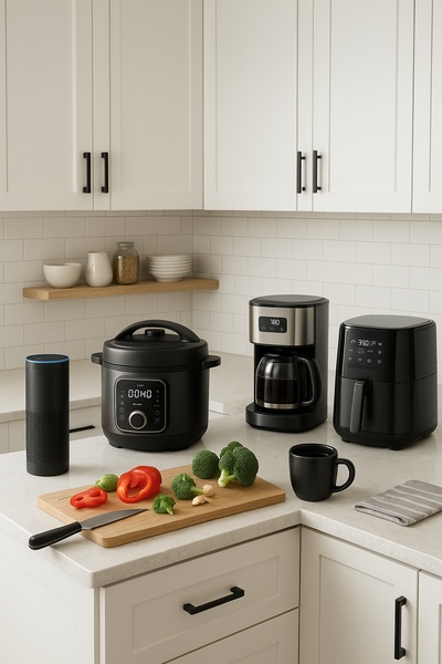
A clean, studio-lit display of a matching kitchen appliance collection in a new blue colorway, set against a neutral background.
Free credits included. No card required
This kitchen appliance ad creative leverages a minimalist hook to emphasize aesthetic value over functional specs. By framing the product as a "new hue" collection, the brand taps into the aspirational nature of home styling, making the hardware feel like a designer accessory rather than just a utility. Focusing on color-coordinated product sets creates a visual cohesion that stops the scroll by signaling high-end home design trends immediately.
For most e-commerce teams, this approach works because it minimizes cognitive load while maximizing brand perception. Using Promer AI to replicate this structured, clean layout allows you to test how different colorways or product combinations perform without the need for constant, expensive photoshoots. In most cases, emphasizing a singular visual theme helps maintain brand consistency across all customer touchpoints.
Successful product photography starts with a strong color story that turns ordinary utility into a statement piece for the home.
Pro tip
When launching a new colorway, ensure your primary headline links the physical product to the 'newness' of the collection. Use the whitespace in the creative to let the product colors breathe, as this contrast signals quality to potential buyers.


Promer helps you find the pattern, adapt it to your product, and create your own version in minutes.






