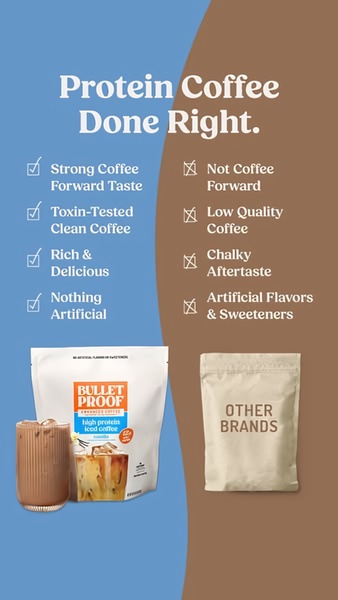
A side-by-side comparison chart illustrating the product quality of high protein iced coffee versus generic market alternatives.
Free credits included. No card required
This iced coffee creative leverages a direct comparison table to simplify the value proposition for the consumer. By contrasting your product against generic alternatives, you establish an immediate perception of quality and authority. This structure effectively neutralizes objections before they form by pairing visual product cues with clear checkmark benefits. The high-contrast color split serves to anchor the viewer's attention, making the brand superiority obvious at a glance. Using Promer AI to mirror this high-performing structure allows you to present your unique value in a digestible, logical format that is ideal for fast-scrolling mobile placements.
A visual comparison is often more persuasive than any list of benefits because it forces the consumer to weigh the value difference themselves.
Pro tip
When building your own comparison table, limit your points to four or fewer to ensure mobile readability. Avoid over-complicating the 'them' side; keep it broad enough to represent the average competitor while keeping your side specific to your proprietary formula.













Promer helps you find the pattern, adapt it to your product, and create your own version in minutes.






