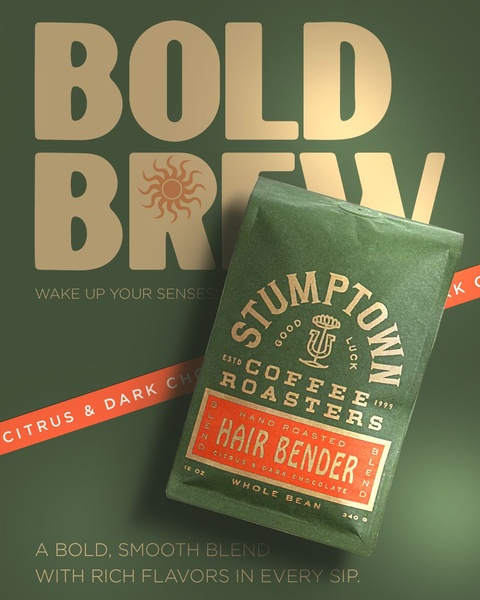
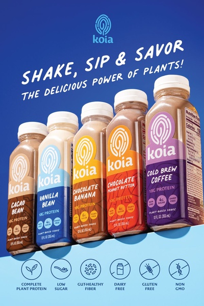
A high-impact ad featuring a 4:5 ratio layout that pairs a product-centric photograph with oversized, bold typography and a refined, monochromatic forest green theme.
Free credits included. No card required
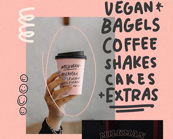
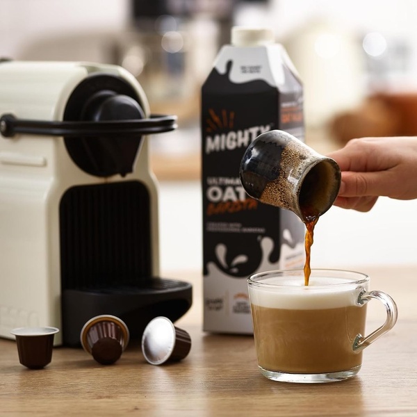
This coffee roasters ad creative succeeds by leveraging high-contrast, oversized typography to command immediate attention within a crowded feed. By using a limited, earthy color palette and isolating the product as the primary focal point, the design creates a sophisticated visual hierarchy that feels premium and intentional. Establishing a bold visual signature allows the product to dominate the frame while maintaining enough negative space to keep the messaging legible and impactful.
For most brands, this type of structured, minimalist approach helps reduce cognitive load for the viewer, ensuring the core value proposition is absorbed instantly. You can easily test these layout patterns using Promer AI to determine how different monochromatic color schemes affect your engagement rates. Depending on your specific audience, varying the background intensity or text weight can help optimize your brand's performance metrics.
A truly effective ad creates a visual ecosystem where the product, the colors, and the typography tell the same story before a single word is read.
Pro tip
To master the bold typography hook, ensure your headline creates a strong visual weight that aligns with the packaging's color story. In most cases, selecting a single, high-contrast accent color—like the orange used here—is more effective for driving clicks than using a complex, multi-colored palette.
Promer helps you find the pattern, adapt it to your product, and create your own version in minutes.






