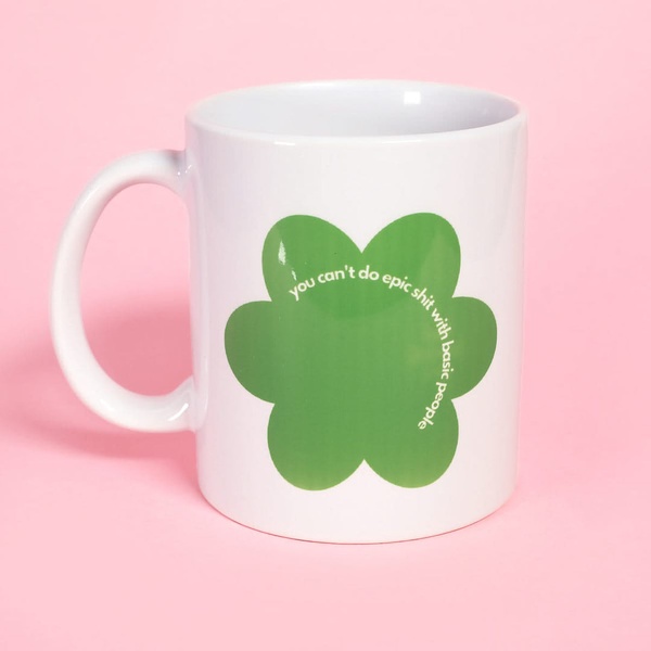
A 1:1 square static ad showcasing a white ceramic mug centered on a solid pastel pink background, featuring a green flower icon with bold white text.
Free credits included. No card required
This ceramic mug ad creative succeeds by stripping away visual clutter to force focus on the message and product silhouette. By pairing a simple, centered product shot with an unconventional, punchy headline, the brand forces the user to pause their scroll to read the text rather than just seeing another generic drinkware product. The strategy leverages high-contrast color theory and provocative typography to anchor the user's attention on the brand's unique voice.
For most ecommerce teams, this minimalist pattern works because it treats the product as a canvas for community-building language rather than a simple utility. You can use Promer AI to analyze similar high-performing layouts and apply these stark, graphic-led design principles to your own product photography to improve stop-rate.
Great product ads function less like a catalog entry and more like a statement piece that communicates a specific lifestyle or attitude.
Pro tip
When using text-heavy hooks on a 1:1 image, ensure the font scale remains legible on mobile screens without sacrificing the overall graphic shape. Test variations where the text is placed outside the product icon versus wrapping within it to see which layout yields better click-through rates.











Promer helps you find the pattern, adapt it to your product, and create your own version in minutes.






