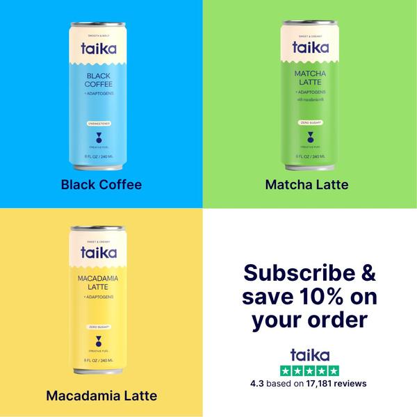
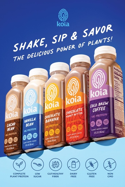
A high-visibility grid layout showcasing three distinct drink flavors with bold brand colors and a clear subscription incentive.
Free credits included. No card required
This creative utilizes a high-contrast grid to display the range of canned coffee products, making it instantly readable for mobile scrollers. By assigning a distinct, vibrant background color to each flavor, the brand effectively differentiates its offerings while maintaining a unified, professional visual system that feels intentional rather than cluttered.
By leveraging Promer AI to analyze high-converting structures, brands can replicate this organized approach to product presentation. This specific pattern works well because it removes decision friction, helping customers quickly identify their preferred flavor while the subscription incentive at the bottom closes the conversion loop.
A perfectly structured grid turns your entire catalog into a single, compelling argument for your brand.
Pro tip
When using a grid layout, rotate the background colors to align with your brand's specific color palette to maintain psychological consistency. Keep the text minimal to ensure that the layout remains legible even at small sizes on mobile devices.









Promer helps you find the pattern, adapt it to your product, and create your own version in minutes.






