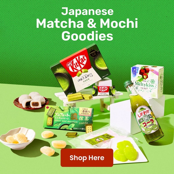
A high-contrast flat lay creative featuring an assortment of Japanese snacks, matcha treats, and mochi arranged on a bright green backdrop with a clear CTA.
Free credits included. No card required
This Japanese snack ad creative uses a symmetrical flat lay strategy to provide an immediate, appetizing overview of the product variety. By utilizing high-contrast green and red color blocking, the ad forces the viewer to focus on the premium nature of the goods while maintaining a clean, professional aesthetic that cuts through social media clutter. A well-executed flat lay converts by showcasing the breadth of your product line in a single, glanceable frame.
For most ecommerce teams, this approach works because it minimizes cognitive load while maximizing the perceived value of an assortment. You can replicate this structural precision using Promer AI to maintain consistent branding and color balance. Depending on your specific snack category, testing this layout against single-product close-ups often reveals that variety packs perform better when the user can see exactly what is inside the box.
Great ads start from a deliberate visual structure that highlights product variety rather than just relying on generic marketing claims.
Pro tip
To increase the effectiveness of a snack flat lay, include one 'bitten' or 'open' version of the product to trigger sensory cravings. This adds a layer of depth to your flat lay, making the static image feel more like an experience than a catalog shot.
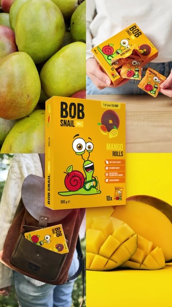


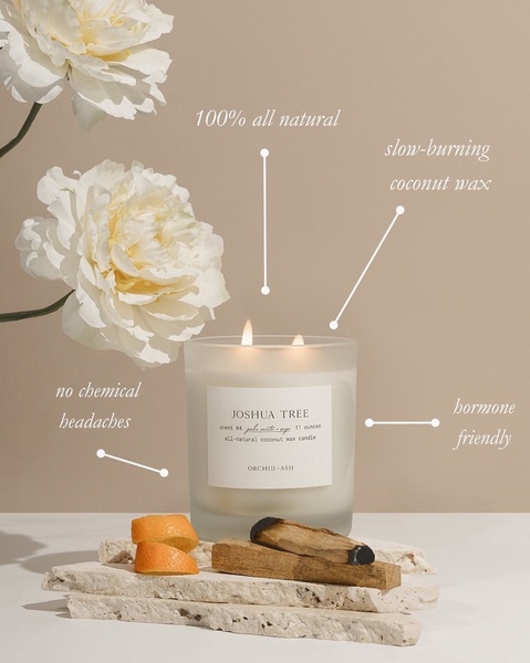

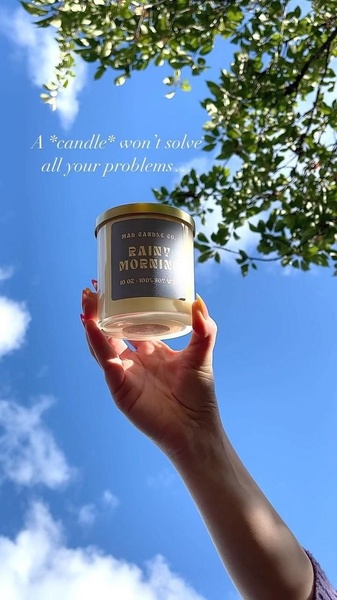





Promer helps you find the pattern, adapt it to your product, and create your own version in minutes.






