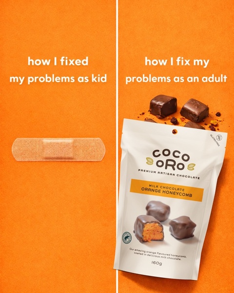
A split-screen ad contrasting a childhood band-aid fix with the adult choice of premium chocolate.
Free credits included. No card required
This Honeycomb Chocolate ad creative captures attention by tapping into shared nostalgia through a simple, high-contrast visual comparison. By positioning the product as a sophisticated reward for adulthood, the brand pivots from a basic feature-led approach to a relatable lifestyle narrative that justifies a purchase as a self-care necessity.
This structure effectively bridges the gap between childhood simplicity and the modern need for a tangible 'fix' in the form of a snack. For most performance teams, this pattern allows you to humanize your product without excessive text, a strategy made easy to replicate using Promer AI to maintain consistent branding while swapping out your specific product imagery.
A winning creative should feel like an inside joke with your customer, where the product is the punchline.
Pro tip
When using comparative hooks, ensure the 'adult' side of your ad prominently features the texture or quality of your product to trigger sensory desire. Don't just show the packaging; zoom into the product contents to visually validate the 'reward' aspect of your messaging.
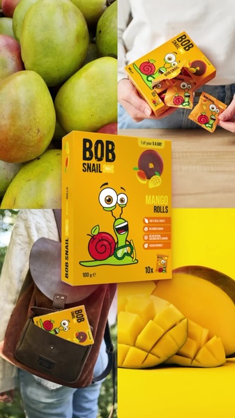


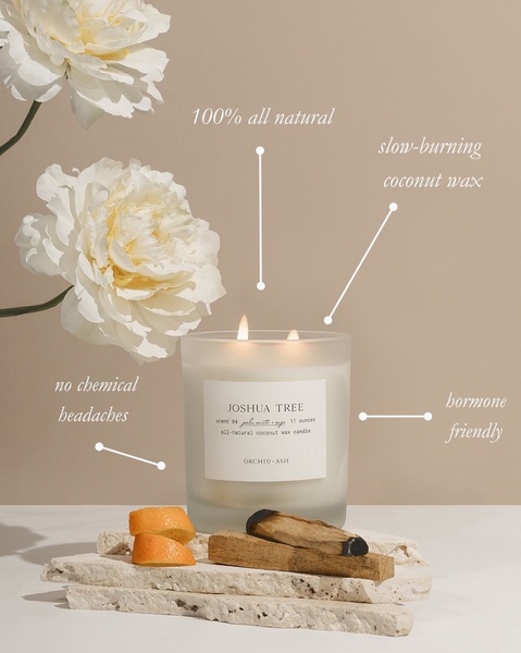





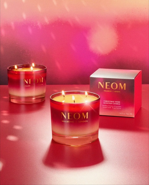








Promer helps you find the pattern, adapt it to your product, and create your own version in minutes.






