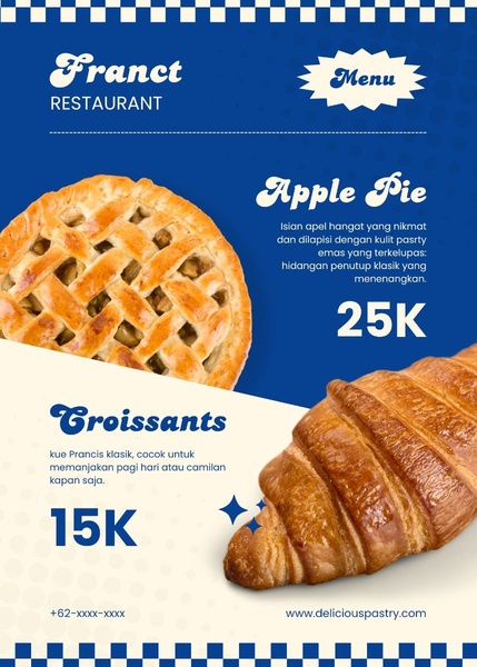
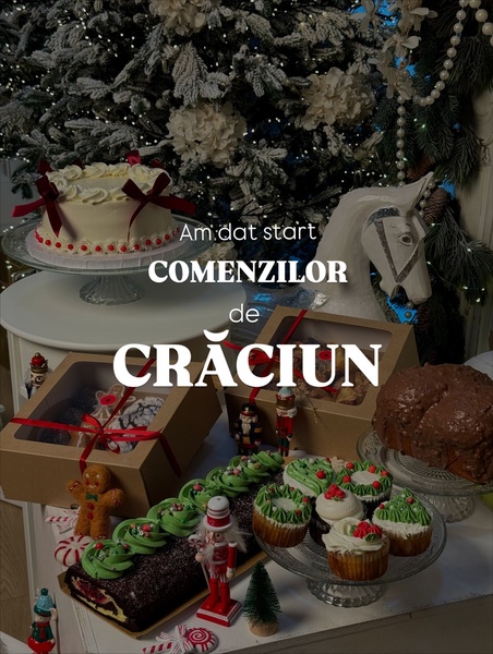
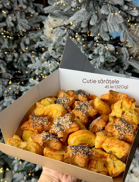
This ad creative utilizes a clean, split-screen menu design to present two distinct bakery items, including their descriptions and pricing.
Free credits included. No card required
This pastry menu ad creative uses a high-contrast color palette and clear typography to make pricing and product identification immediate. The core strategy relies on the instant readability of the menu layout, which removes friction for the customer by clearly displaying the value and price of each item. By framing the products as a curated selection, it minimizes cognitive load and encourages quick decision-making.
This structured approach is highly effective for food and beverage ads because it highlights the product quality while providing essential purchasing information at a glance. To replicate this level of visual organization for your own brand, you can use Promer AI to analyze successful structures and adapt them to your specific product photography, ensuring your menu-style ads feel both custom and professional.
Great ads start from an idea, a feeling, or a structure, not a blank design.
Pro tip
When using a menu-style creative, always ensure your product photography is high-resolution and follows a consistent lighting style to maintain visual hierarchy. If your prices vary, use bold fonts for the price to ensure the primary conversion element remains the anchor of the composition.


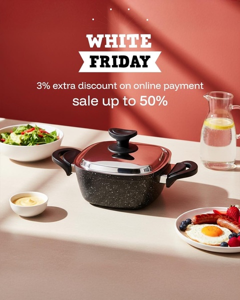
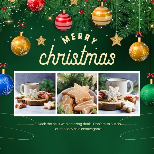
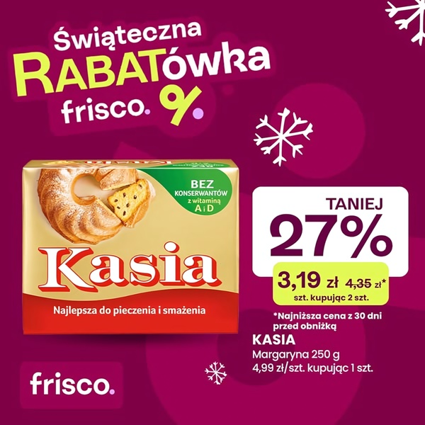

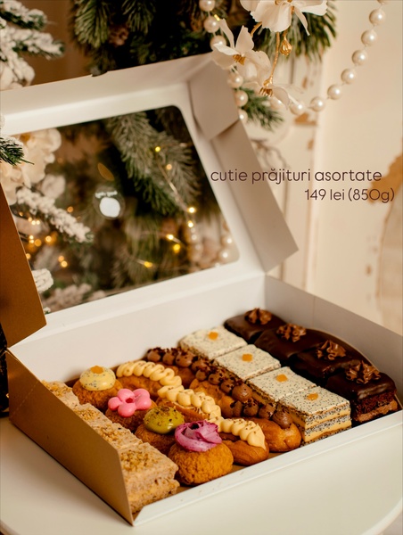

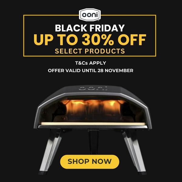
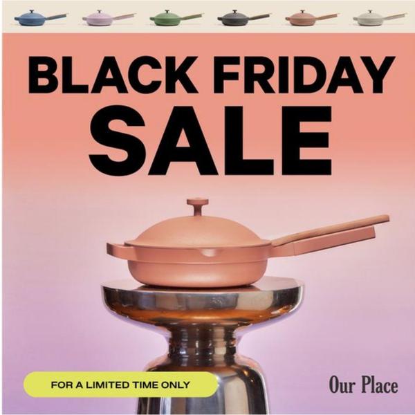
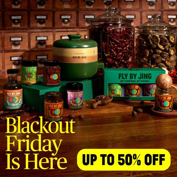
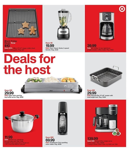
Promer helps you find the pattern, adapt it to your product, and create your own version in minutes.






