


Why the Cross-Section Is the Most Important Shot in Bakery Advertising?
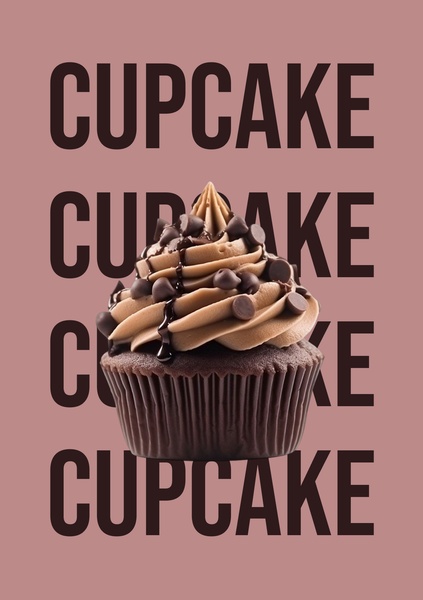
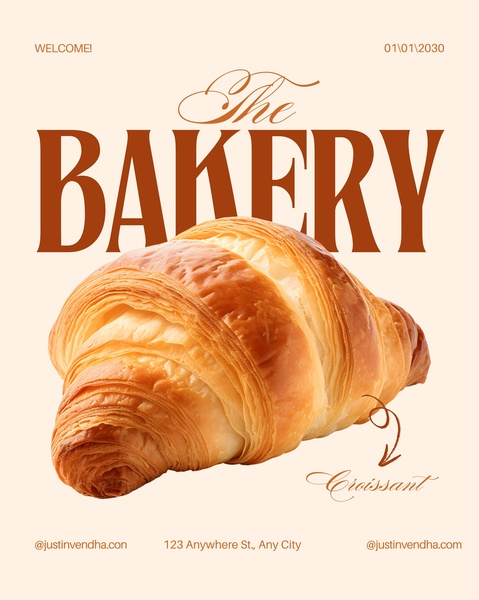
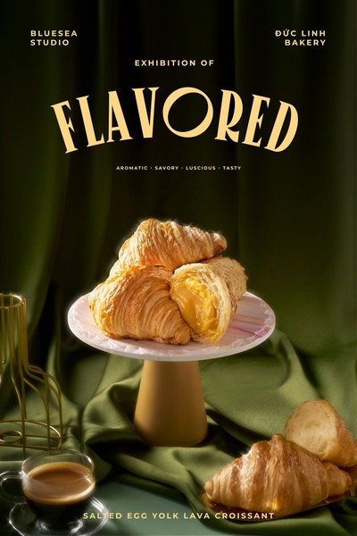
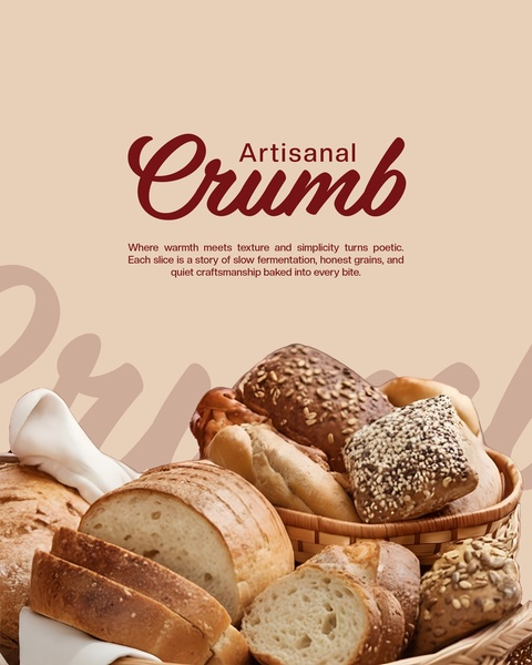
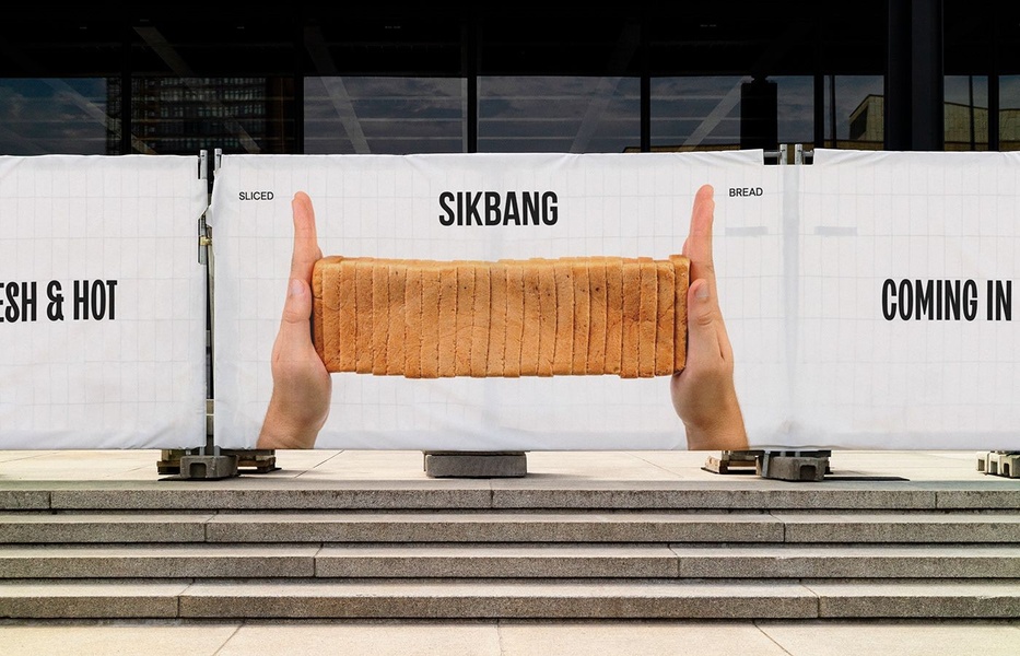
A bakery product has its proof on the inside. A loaf of sourdough, a croissant, a slice of layered cake - the quality of what you're buying is in the crumb structure, the lamination, the texture, the color of the interior. An exterior shot of a sealed loaf proves nothing. A cross-section that shows an open crumb, defined layers, or a saturated filling tells the buyer everything they need to know about whether this bakery is the real thing before they've tasted a bite.
Freshness cues work the same way. Steam rising from a cut loaf, a golden crust in natural light, a croissant broken to show the flaky interior - these aren't styling choices, they're the visual equivalent of the smell that pulls someone into a bakery.
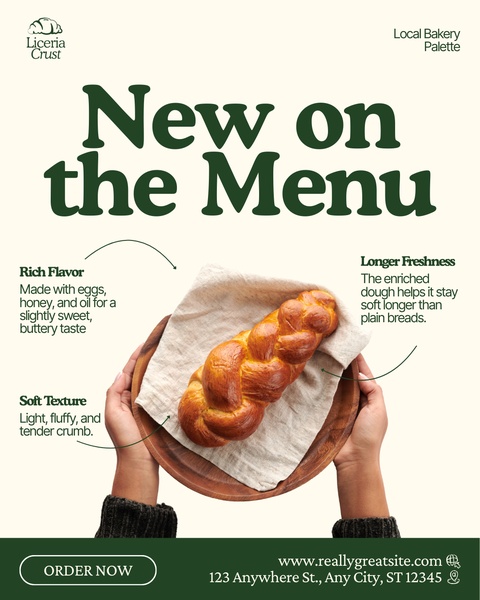
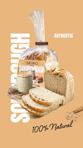
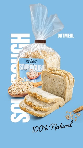
Alongside texture, the artisan or local identity narrative closes the decision: a named bakery, a "100% natural" or "homemade" credential, a sense that a real person made this rather than a factory. Together, the cross-section, the freshness, and the craft identity are the three proof layers that separate a bakery ad that converts from a generic product photo.
Top Creative Bakery Ads to Learn From
Here are nine bakery advertising examples from the library, starting with texture-led product shots and ending with menu and sale layouts. Each one shows what the ad does and what you can borrow.
Example 1: Glazed Doughnut Close-Up (Product Hero, 1:1)
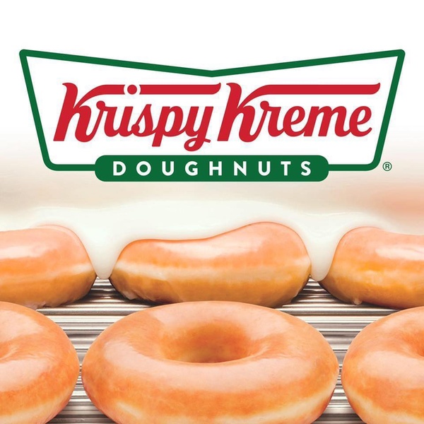
The frame is a tight close-up of fresh doughnuts with thick glaze running over them. White, warm orange and a brand green keep the palette clean, and the logo sits at the top so the brand is clear even from a fast scroll.
Borrow: crop in until the glaze or crumb fills the frame, and light it like daylight so the product reads as fresh rather than plastic.
Example 2: Top-Down Pastry Box (Product Hero, 4:5)
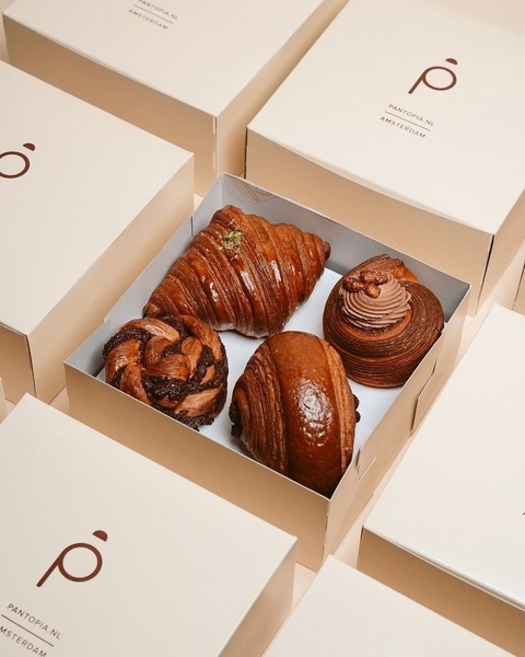
Several boxes of pastries are shot from above in a centered, grid-like arrangement, so the buyer sees exactly what is inside at a glance. Cream and dark brown give it a gourmet look, and a small logo repeats across the boxes with no headline competing for attention.
Borrow: a top-down box shot for gift or assortment products, with the logo on the packaging and nothing else on the image.
Example 3: "One Bite Is Never Enough!" Cookie Gift Box (Product Hero, 4:5)
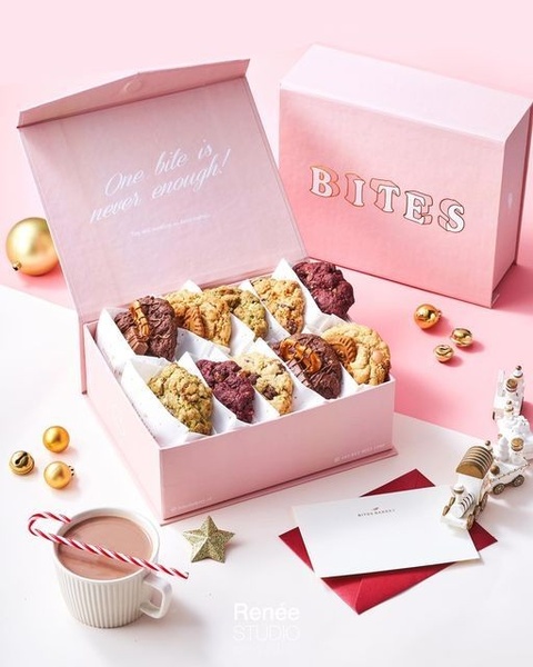
An open branded cookie box shows assorted gourmet cookies in a flat lay, with a candy cane and gold ornaments nearby. The only copy is "One bite is never enough!" printed inside the lid, in a soft pink, white and gold palette.
Borrow: put the hook on the packaging itself, so the line looks like part of the product and the image stays uncluttered.
Example 4: Festive Savory Pastry Box (Product Hero, 3:4)
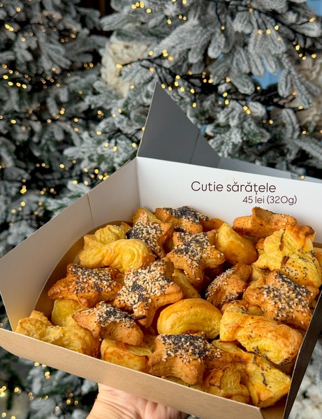
A gift box packed with star-shaped savory pastries is shot from above, with a blurred Christmas tree behind it. Warm browns and gold set the mood, and a small price and weight line sits on the image.
Borrow: a seasonal bokeh background to make a simple item feel like a holiday gift, with the price and weight kept small so buyers can qualify themselves.
Example 5: "Forget the Roses, Get a Cookie" (Bold Claim, 3:4)
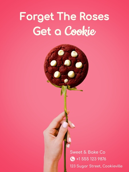
A cookie takes the place of a flower on a green stem, against a vivid pink background. The headline "Forget the roses, get a cookie" challenges the usual gift, and a single centered product leaves nothing else to look at.
Borrow: swap your product into a familiar gift or ritual, and keep the product sharp enough to identify at a glance.
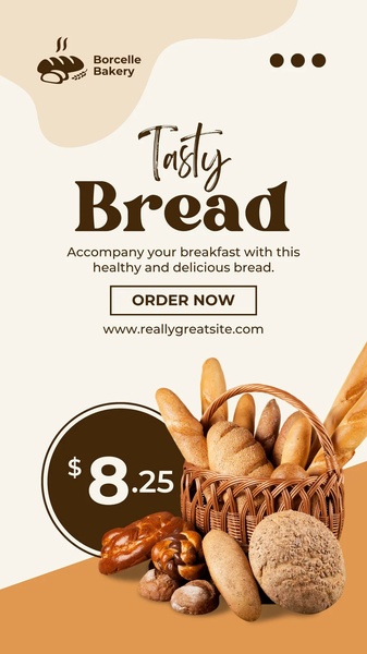
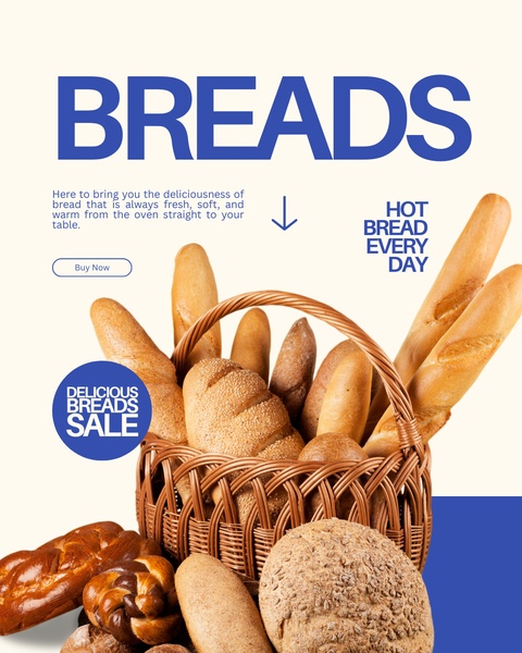
Example 6: Signature Bread Set on Red (Offer & Sale, 16:9)
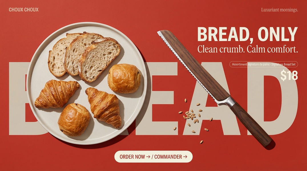
Artisan loaves, croissants and a wooden-handled bread knife lie flat on a solid red background, with oversized white text beside them. The beige and brown bread stands out hard against the red, and the wide frame reads like a magazine spread.
Borrow: one saturated background color behind neutral baked goods, with large type and no extra props.
Example 7: Two-Item Pastry Menu (Offer & Sale, 3:4)
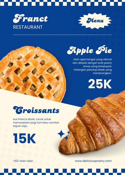
A diagonal split divides the frame into two panels, one per pastry, in blue and cream. Each panel has a short description and a large price, so the ad works like a menu board.
Borrow: a split layout when you sell a small range, with the price as the biggest element on each side.
Example 8: Birthday Cake, 40% Off (Offer & Sale, 1:1)
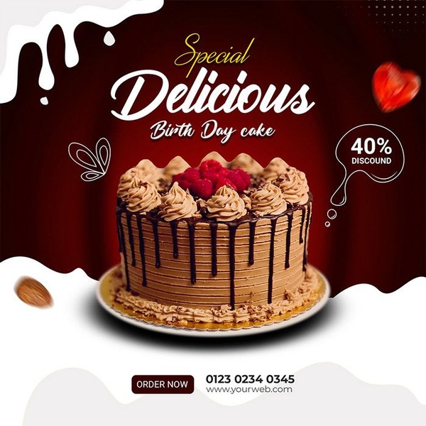
A chocolate birthday cake sits dead-center on a dark red background, with white text around it. A 40% discount callout takes the high-visibility spot without covering the cake, and an order link sits below.
Borrow: a centered product, a high-contrast background and one discount shape, then test the shape - circle or banner - before changing anything else.
Example 9: Pizza Oven "Only Once a Year" (Offer & Sale, 1:1)
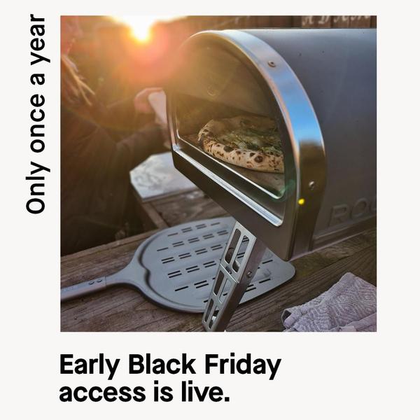
A warm, close-up shot of a pizza baking in an outdoor oven fills the square. The headline "Only once a year" frames the early Black Friday sale as rare, in a short line that reads on a phone in a second.
Borrow: tie the offer to a rare moment and keep the headline under six words, with food shot in warm light so the oven or tray looks worth owning.
Bakery Advertisement Ideas to Borrow From These Examples
- Crop in on the texture - glaze, crumb or filling should fill the frame (Examples 1 and 2).
- Put the hook on the packaging - a line inside a lid or on a box feels like part of the product (Example 3).
- Use the season as the background - a blurred holiday scene turns a snack into a gift (Example 4).
- Subvert a gift or ritual once - keep the product clear while the idea does the work (Example 5).
- Pick one loud color - neutral bread on a solid background stops the scroll (Example 6).
- Make the price the biggest element - menu layouts and discount callouts both rely on it (Examples 7 and 8).
- Tie the sale to a rare moment - a short "once a year" line makes the offer feel limited (Example 9).
How Promer AI Generates Your Bakery Ad From Product, Flavor, and Freshness Story?
Knowing which proof to lead with - texture close-up, occasion moment, artisan identity, or daily freshness - still leaves the headline, the product framing, and the CTA unwritten. That's the part Promer AI handles from your actual product page rather than a blank brief.
Paste your product page and the AI reads it, pulling out the baked good, the key ingredient or flavor, the freshness story, and the occasion it fits - along with your ideal customer and what brings them back daily or for a special moment. It then writes the headline, body, and CTA on top of the winning structure you picked.
To start from a layout in the library, AI Ad Clone rebuilds a reference such as the pastry menu or the discount cake around your product, with headline, body and CTA suggested and editable. If your photos are the weak point, AI Photoshoot turns the ones you already have into studio-quality images.
Review everything before it runs - generated creatives can have mistakes - and make sure every price and product detail is accurate before publishing.





