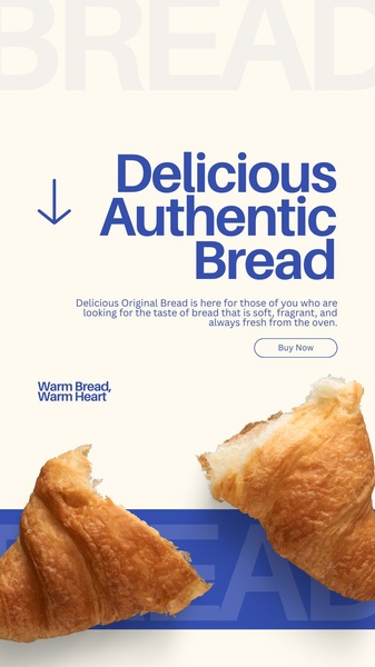
A clean, vertical ad layout featuring high-quality croissant imagery paired with minimalist typography and clear brand messaging.
Free credits included. No card required
This croissant ad creative succeeds by utilizing a high-contrast, minimalist aesthetic that allows the product's texture to drive the initial visual engagement. By isolating the product against a neutral cream background, the brand removes visual clutter, ensuring the viewer's focus remains on the quality of the bread while the bold blue typography commands attention for the primary value proposition. The simplicity of this layout allows for an immediate emotional connection, making the 'warm' sensory appeal of the product the primary driver of the ad's performance.
For most ecommerce teams looking to scale food photography, this pattern demonstrates how negative space can be a conversion tool rather than a design void. Teams can leverage Promer AI to replicate this structured approach by replacing the source imagery with their own high-resolution product photography while keeping the clean, high-conversion typography hierarchy intact. This method typically helps brands maintain visual consistency across platforms without requiring constant custom design cycles.
Great ads start from an idea, a feeling, or a structure, not a blank design.
Pro tip
When using food photography for ad creatives, ensure your product subject is captured in a high-resolution, close-up shot that emphasizes tactile details like steam, crumb structure, or freshness. This visual 'texture' acts as a passive hook that can often perform better than text-heavy headlines alone.









Promer helps you find the pattern, adapt it to your product, and create your own version in minutes.






