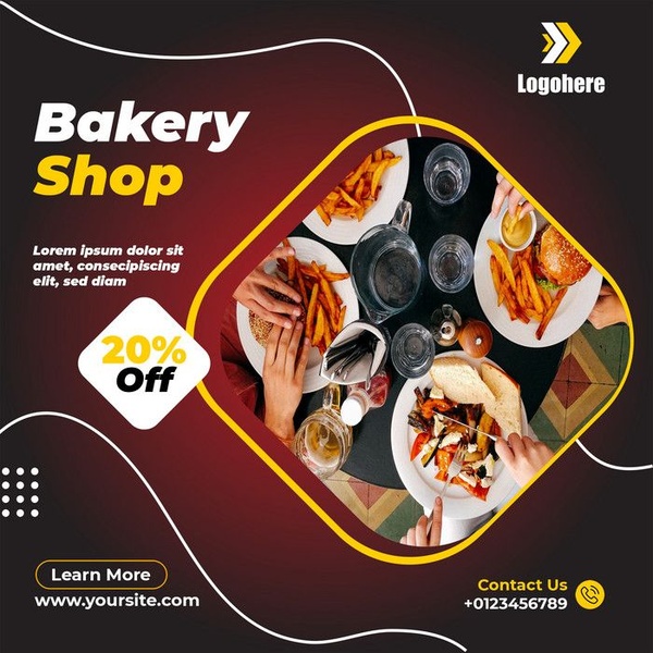
A square ad creative utilizing a top-down food photography layout with a bold 20% off badge to incentivize immediate customer action.
Free credits included. No card required
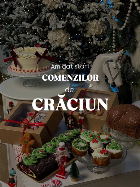
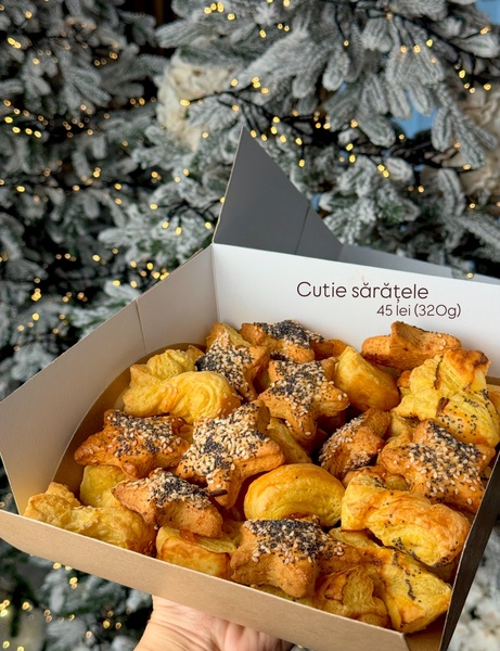
This bakery shop ad creative leverages a classic promotional hook by pairing high-quality, appetising top-down food photography with a high-contrast discount badge. By isolating the product imagery within a rounded geometric frame against a deep burgundy background, the design creates a clear visual hierarchy that directs the viewer's eye immediately from the meal to the 20% off offer. Strategic use of high-contrast yellow elements ensures the discount and brand identity remain the focal points for the scrolling user.
For most ecommerce teams, this structure succeeds because it balances high-intent appetite appeal with a low-friction value proposition. Using Promer AI allows you to standardize this effective layout while swapping in your own specific menu items, colors, and branding to maintain consistency without the need for manual design updates.
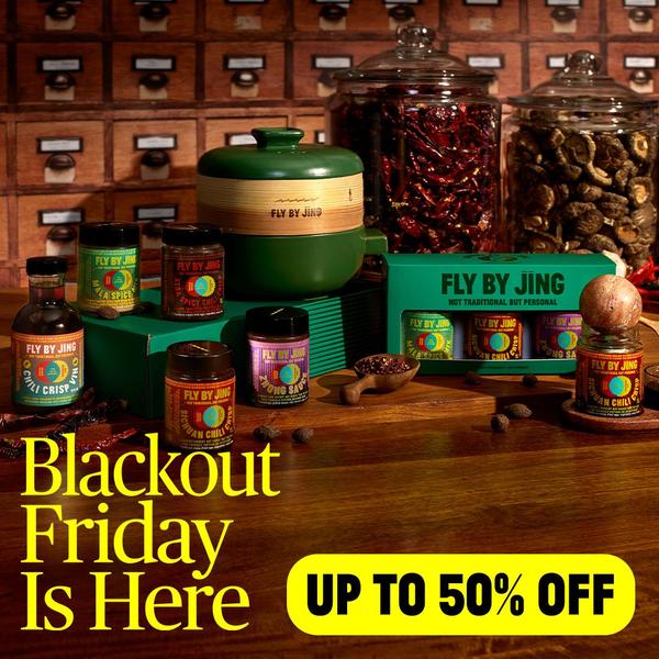
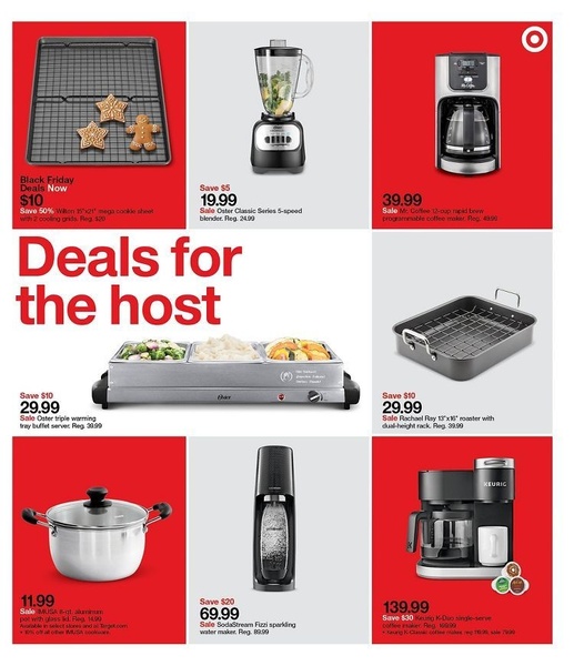
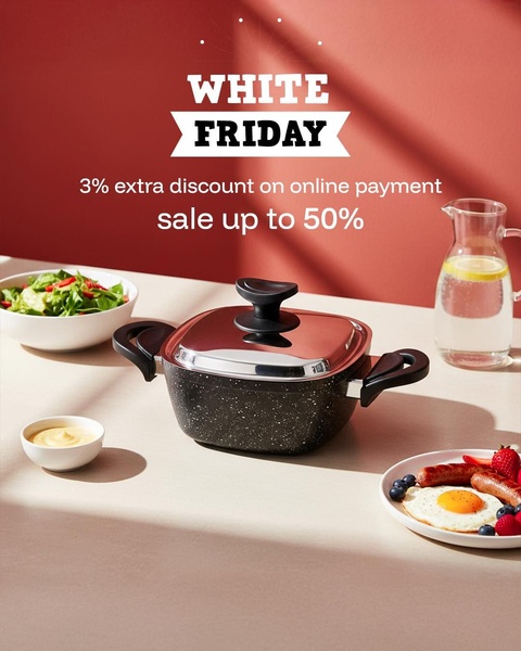
A winning ad structure relies on a clear visual hierarchy that guides the customer from the product appeal directly to the value proposition.
Pro tip
To increase your conversion rate, ensure your top-down photography includes human elements like hands interacting with the food. This adds a sense of liveliness and authenticity that static product shots often lack, helping to improve engagement in competitive social feeds.
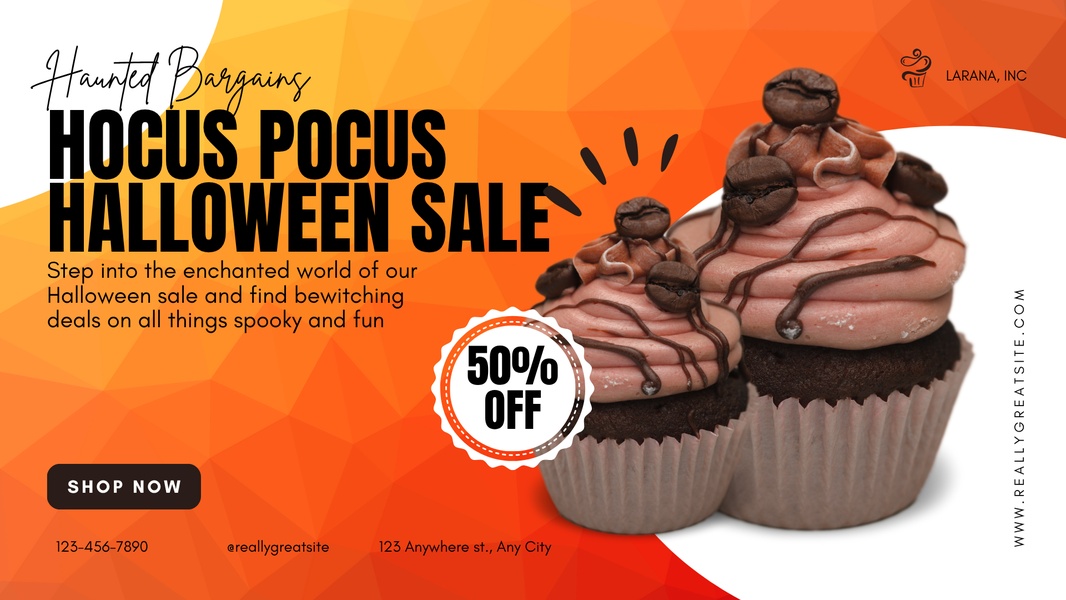
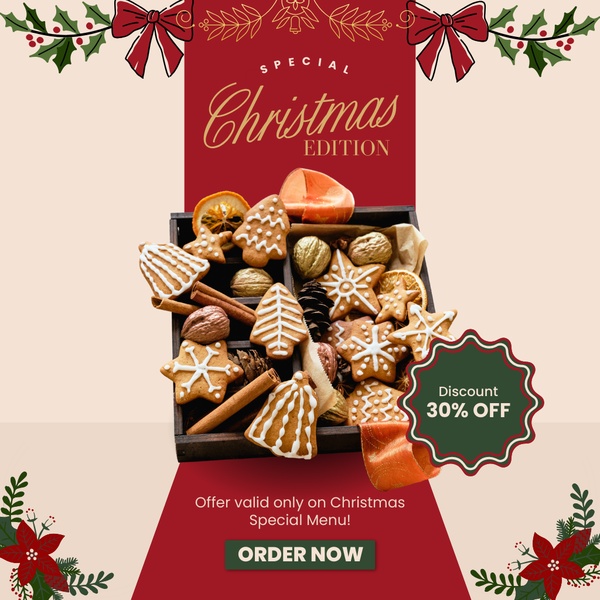


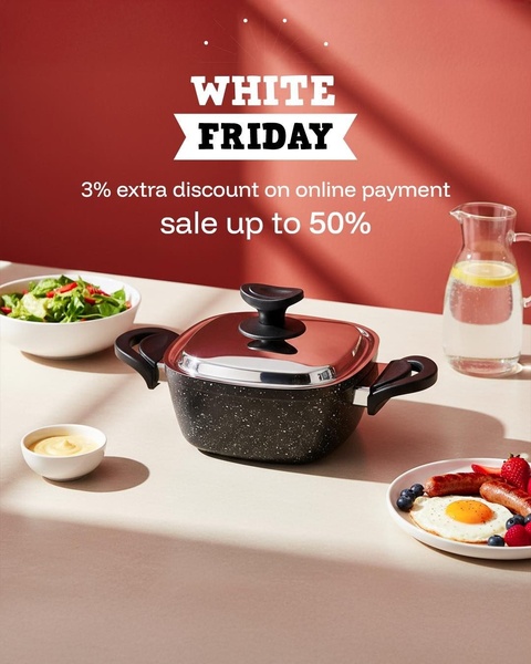
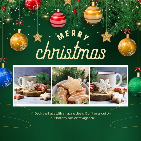
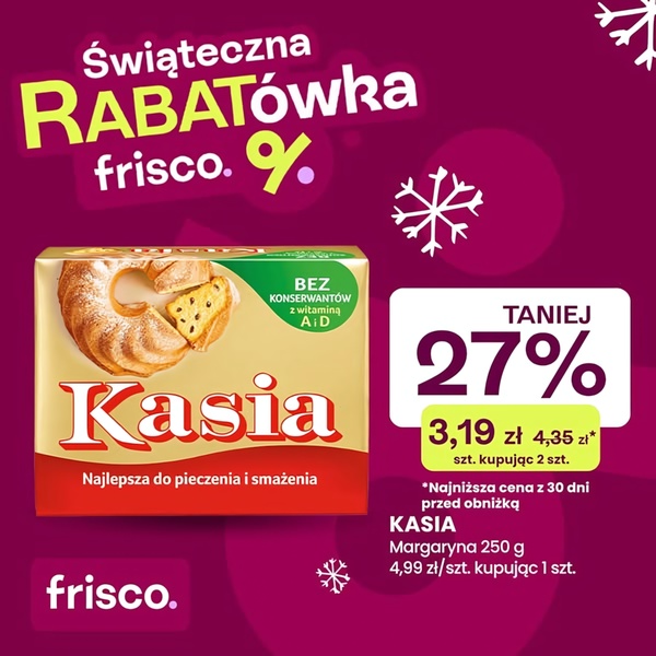

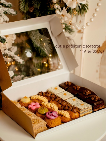



Promer helps you find the pattern, adapt it to your product, and create your own version in minutes.






