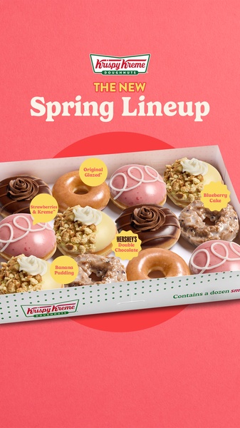
A top-down, high-energy flat lay featuring a full assortment of seasonal doughnuts with clear callout labels to highlight variety.
Free credits included. No card required
This doughnut box ad creative succeeds by combining a high-contrast, cheerful color palette with clear, informative visual callouts. By utilizing a clean flat lay, the brand immediately centers the product as the hero while maintaining an organized aesthetic that encourages viewers to explore the individual flavors. Using clear visual labels to bridge the gap between product discovery and appetite appeal is the core driver of success for this ad.
For most food and beverage teams, the challenge lies in communicating variety without cluttering the frame. Using Promer AI, you can replicate this organized, label-centric structure for any product lineup, ensuring that each feature is showcased with intent. This approach typically performs well because it respects the user's need for instant information while maintaining a high-fidelity visual standard.
A truly effective ad translates the physical joy of the product into a clear, scannable visual format that demands action.
Pro tip
To boost engagement, match the background color palette to the seasonal theme shown in the product labels. In most cases, keeping the text labels concise and aligned with the product they identify prevents visual noise and keeps the focus on the primary subject.


















Promer helps you find the pattern, adapt it to your product, and create your own version in minutes.






