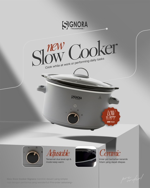
A clean, studio-lit 4:5 ad creative showcasing a gray slow cooker with clearly labeled product benefits and a soft, neutral color palette.
Free credits included. No card required
This slow cooker ad creative effectively uses a minimalist aesthetic to highlight utility and design simultaneously. By anchoring the image on a neutral gray background, the brand ensures the viewer’s eye is immediately drawn to the product silhouette and the value-driven typography, creating a clear path for user interaction. The core strategy here is to pair direct product benefits with a clean, aspirational visual style that suggests reliability and ease of use.
For most ecommerce teams, this balance is essential because it avoids clutter while answering the 'what' and 'why' of the product quickly. You can leverage the Promer AI platform to identify similar high-performing structures, allowing you to replicate this clean visual hierarchy for your own product catalog without needing a full-scale professional photoshoot.
A winning creative starts from a clear value-based hierarchy that respects the user's limited time while showcasing the product's essential features.
Pro tip
When focusing on a direct product benefit, ensure your typography does not compete with the product image. Use high-contrast font weights for key features while keeping descriptive text secondary, just as this creative does to keep the viewer’s eyes focused on the appliance.











Promer helps you find the pattern, adapt it to your product, and create your own version in minutes.






