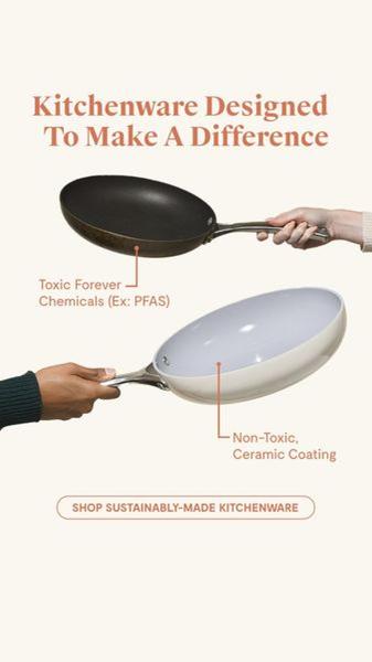
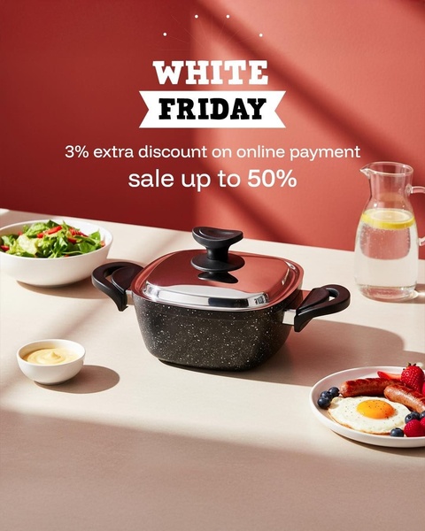
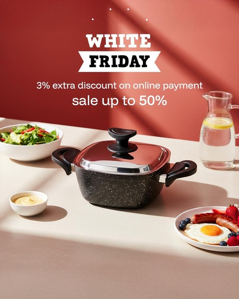
A split-screen style 9:16 vertical creative comparing a traditional toxic pan against a sustainable non-toxic ceramic alternative.
Free credits included. No card required
This pan ad creative leverages a stark visual contrast to capture the user's attention in the feed, immediately identifying a health risk associated with conventional cookware. By placing a 'toxic' pan against a 'non-toxic' ceramic version, the creative forces an instant evaluation of the viewer's current kitchen habits through a minimalist, clean aesthetic that prioritizes clarity over clutter. The core of this strategy is the immediate realization of a negative health impact that the product explicitly solves without requiring long-form text.
For most ecommerce teams, this 'Us and Them' positioning is effective because it frames the product as a necessary upgrade to a safer lifestyle. You can analyze and replicate this successful structural logic using Promer AI to test different visual comparisons for your specific category. Relying on such direct value propositions is typically more effective in the current market than generic branding exercises, provided your product truth matches the problem highlighted.
Great ads start from a visual hook that addresses a specific pain point before the user even reads the headline.
Pro tip
When using a direct comparison, ensure the 'problem' side of your creative is shown in a way that feels relatable but not overly aggressive. Test adding a subtle animation to the labels so the callout appears as the user watches, which can increase dwell time and engagement on short-form platforms.












Promer helps you find the pattern, adapt it to your product, and create your own version in minutes.






