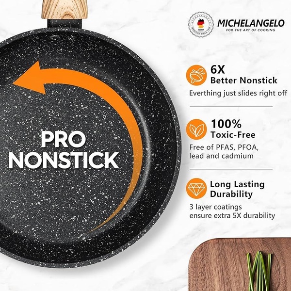
A clean, high-contrast ad layout for a nonstick frying pan that uses icon-based storytelling to communicate product durability and safety features.
Free credits included. No card required
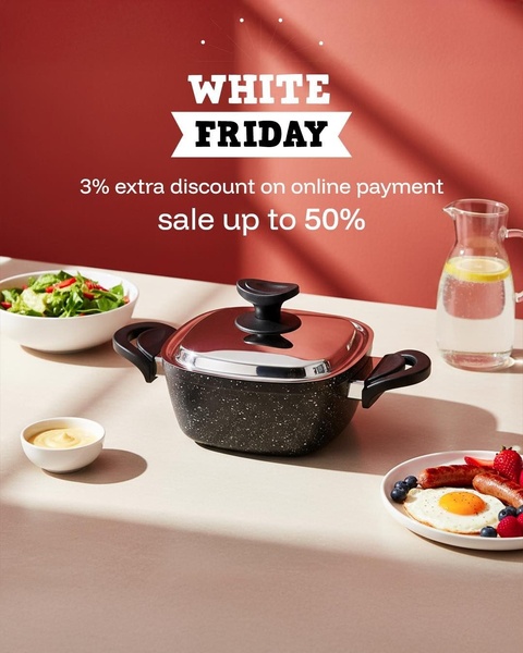
This nonstick frying pan ad creative relies on a high-contrast visual hierarchy that immediately educates the user on core value propositions. By isolating the product against a clean background and using a bold arrow to emphasize the key performance benefit, it forces the eye to scan from the hook directly into the specific safety and quality icons, creating a seamless information flow for the viewer.
This structure performs well because it removes cognitive load, allowing the consumer to process product advantages instantly. Using Promer AI to analyze these layout patterns helps ecommerce teams standardize their own visual communication. In most cases, distilling complex features into icon-based lists on a static 1:1 canvas is highly effective for reducing bounce rates on social feeds.
Great product ads are structured like a fast-moving infographic, leading the customer through the key reasons to buy before they even finish scrolling.
Pro tip
Focus on the 'why' behind each feature icon rather than just the technical specification. In the case of cookware, translate 'toxic-free' into 'safe for your family' to bridge the gap between product feature and emotional benefit.










Promer helps you find the pattern, adapt it to your product, and create your own version in minutes.






