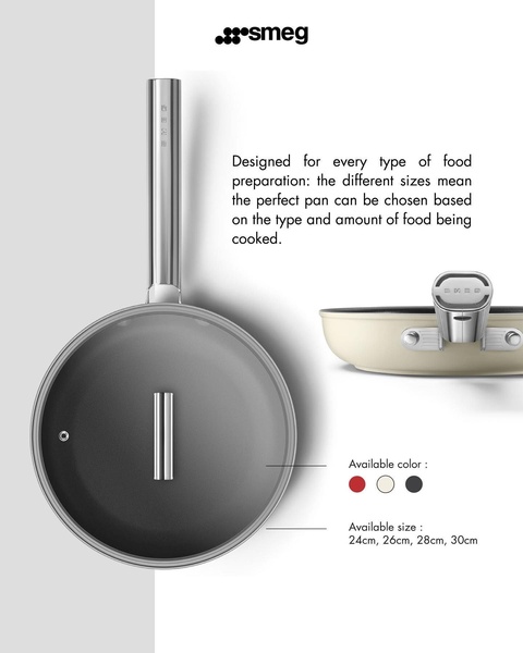
A clean, high-contrast ad featuring a non-stick pan from top-down and side angles, highlighting size variations and available color options.
Free credits included. No card required
This non-stick pan ad creative succeeds by leveraging a high-contrast, minimalist visual style that centers the product as the hero. By stripping away complex backgrounds and using clear, direct labeling for sizes and colors, the ad removes friction for the customer, making the product utility the primary focus of the viewer's experience.
This structure effectively communicates quality and variety without overwhelming the user, which is a common pitfall for kitchenware brands. Using a tool like Promer AI allows you to adopt this clean, feature-focused aesthetic for your own inventory, ensuring your brand's core benefits are highlighted with the same level of visual clarity.
Great ads start from an idea, a feeling, or a structure that highlights product truth rather than relying on generic design clutter.
Pro tip
When showcasing physical goods, always pair your product with a text call-out that addresses a specific pain point—in this case, the need for the 'perfect pan' size. This bridges the gap between an aesthetic image and a functional shopping decision, which typically increases intent-to-purchase metrics.


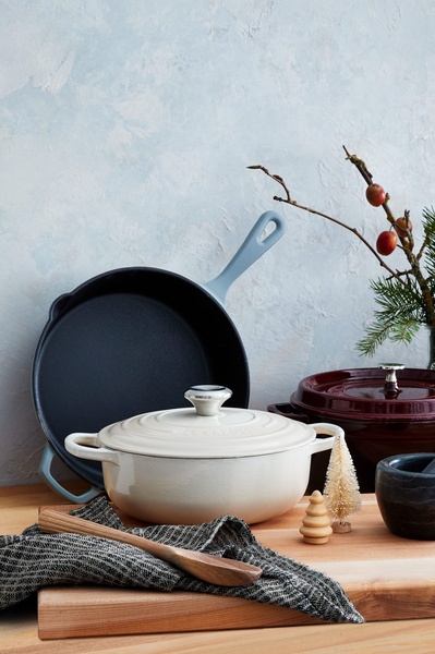



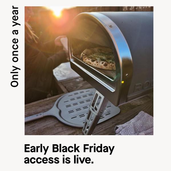


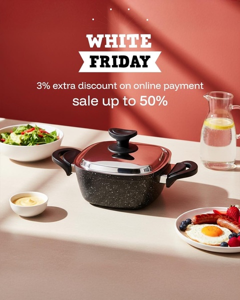






Promer helps you find the pattern, adapt it to your product, and create your own version in minutes.






