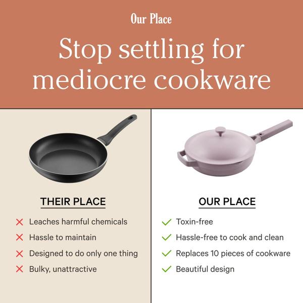
A split-screen comparison table contrasting a generic pan with a high-quality branded option to highlight key performance and health benefits.
Free credits included. No card required
This non-stick cookware ad creative effectively uses a direct comparison to simplify a consumer's purchasing decision by pitting a generic, low-quality alternative against the advertised product. The core of this strategy is the visual 'us versus them' framing, which immediately signals to the viewer that the brand is solving a tangible pain point rather than just selling a luxury item. By clearly laying out the negative traits of common cookware next to the superior features of their own, the creative builds immediate authority and logical justification for a premium choice.
Structuring your ads this way works for most product categories because it removes cognitive load from the potential customer during their scroll. Utilizing Promer AI allows performance marketers to rapidly test similar comparative structures, ensuring that the visual comparison remains clean and readable across various screen sizes. This pattern is particularly successful when the visual differences between a 'standard' product and your 'optimized' version are stark, as it provides a clear reason for the customer to switch brands immediately.
A powerful ad creative does not need complex animation to convert; it simply needs to clearly define the problem and present the superior solution.
Pro tip
When running comparative ads, ensure your chosen competitor is perceived as the baseline standard in your category, not an obscure fringe product. This reinforces the idea that your item is the obvious upgrade for any rational buyer. Focus your comparison list on the three most painful common problems rather than listing generic features.









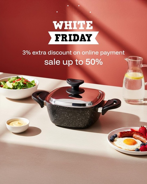








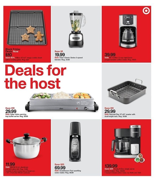
Promer helps you find the pattern, adapt it to your product, and create your own version in minutes.






