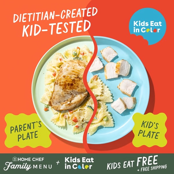
A 1:1 format ad creative using a split-screen layout to show how a meal kit product serves both parents and children differently.
Free credits included. No card required
This meal kit ad creative leverages a stark split-screen visual to anchor the product's value in a relatable, high-friction pain point: cooking separate meals for parents and picky eaters. By using the 'Dietitian-Created, Kid-Tested' claim against the visual proof of two tailored plates, the ad immediately establishes trust and utility for busy caregivers without needing complex motion graphics.
The core strength of this design is its ability to communicate a benefit-first narrative using zero-friction visual storytelling. For most ecommerce teams, this type of structure performs well because it translates the complex value of a service into an instant, intuitive benefit, a process that Promer AI simplifies by allowing you to map your own product's utility into similar comparative layouts.
A winning ad structure relies on a visual metaphor that instantly clarifies how your product solves a specific customer friction point.
Pro tip
When using comparative layouts, ensure the visual difference between the two sides is dramatic enough to be understood in less than two seconds of scrolling. If the sides are too similar, the 'Us vs Them' value proposition fails to register, causing users to scroll past the ad without absorbing the primary message.













Promer helps you find the pattern, adapt it to your product, and create your own version in minutes.






