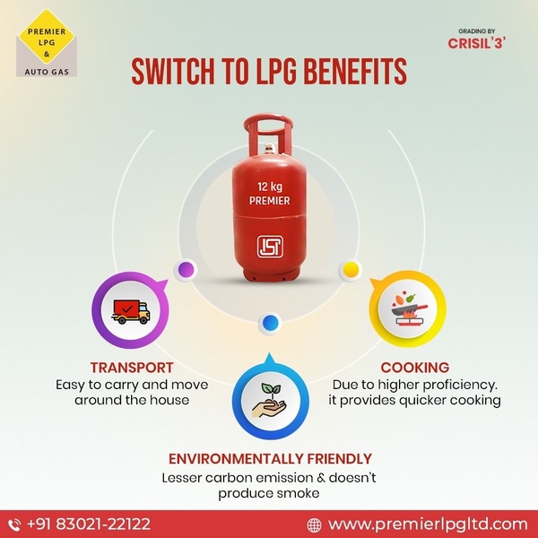
A clean, instructional infographic ad highlighting the transportability, cooking efficiency, and environmental friendliness of an LPG gas cylinder.
Free credits included. No card required
This LPG gas cylinder ad creative employs a central-anchor layout that creates immediate cognitive ease by segmenting complex product benefits into distinct, colorful icons. By pairing a high-quality product image at the center with three primary value propositions, the ad removes friction for the viewer and ensures the key selling points are absorbed in seconds. Using a structured infographic format effectively organizes the message for busy scrollers who need to understand product value instantly.
For most performance teams, this pattern of centralizing a product while branching out benefits is a reliable way to boost engagement and reduce bounce rates. You can replicate this organizational structure using Promer AI to maintain high-quality visuals while highlighting your product's specific edge. This approach typically performs well when your goal is to educate the customer on why they should switch from legacy solutions to your current offering.
A clear visual hierarchy is the fastest way to turn a complex feature set into a persuasive customer benefit.
Pro tip
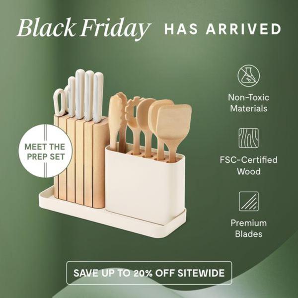
When using this infographic layout for physical products, ensure your icons remain highly stylized and minimalist to prevent visual noise. If you want to increase clarity, group your benefits by intensity or importance, placing the most compelling claim at the 12 o'clock or right-hand position to maximize impact.

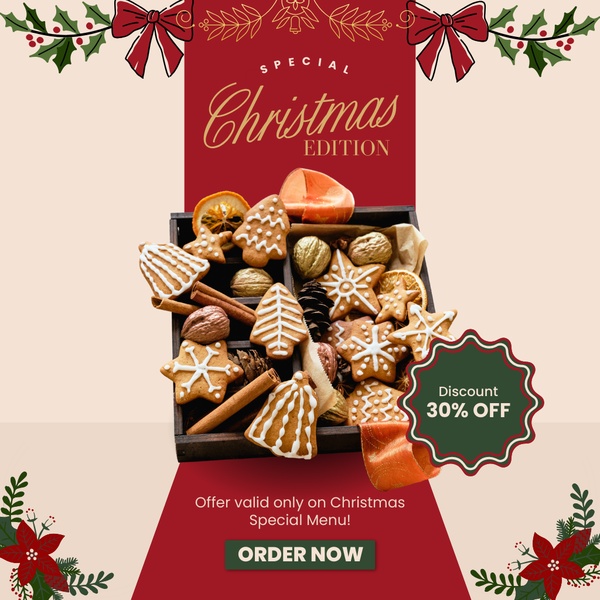




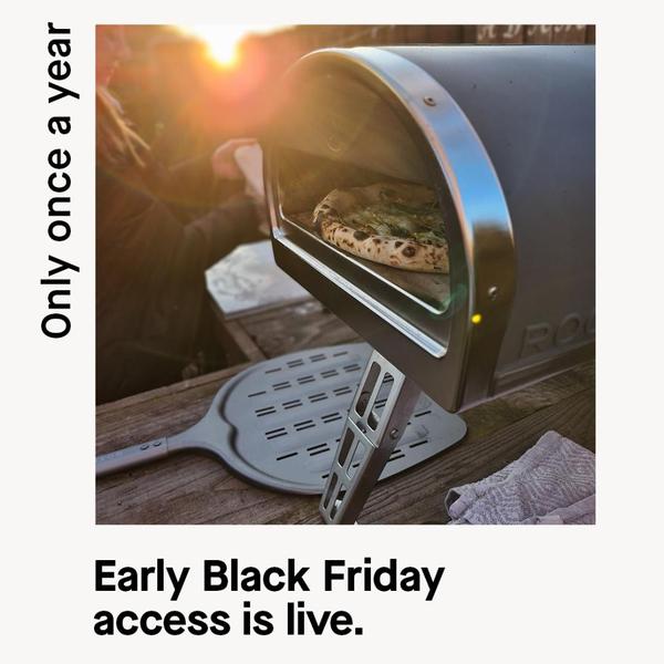
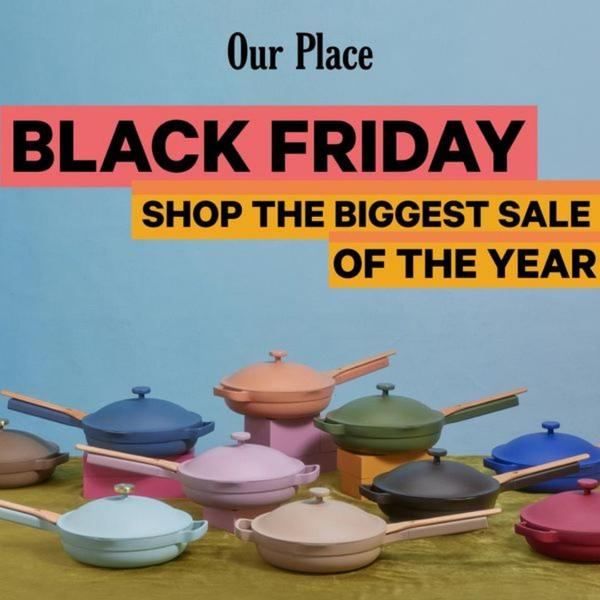

Promer helps you find the pattern, adapt it to your product, and create your own version in minutes.






