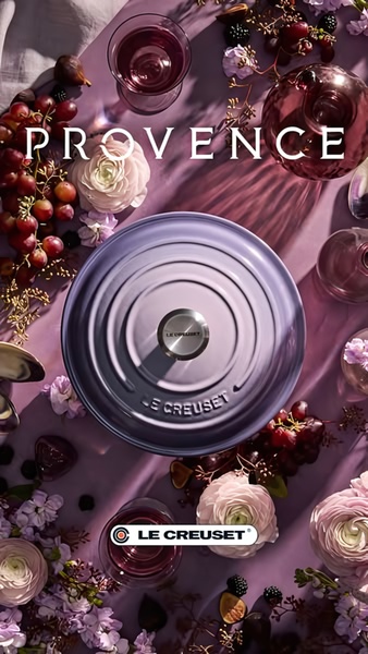
A high-end, top-down flat lay featuring a purple cast iron dutch oven surrounded by grapes, figs, and floral arrangements in a monochromatic lavender palette.
Free credits included. No card required
This cast iron dutch oven ad creative leverages a hyper-focused, monochromatic color palette to instantly signal luxury and intentional home living. By utilizing a top-down, balanced flat lay composition, the creative forces the viewer to focus entirely on the product’s premium finish while the surrounding organic textures of fruit and flowers evoke a sensory, high-end lifestyle context.
This aesthetic approach succeeds because it shifts the focus from hard product features to emotional branding, which is often essential for premium kitchenware. When you build a similar strategy using Promer AI, you can align your own visual identity with these high-conversion patterns to stop the scroll through sheer visual cohesion rather than aggressive calls to action.
Great ads start from an idea, a feeling, or a structure, not a blank design.
Pro tip
To master the monochromatic visual hook, ensure your prop color palette is strictly within the same color family as your product finish. This reduces visual noise and keeps the focus squarely on your item, preventing the viewer from being distracted by clashing elements.





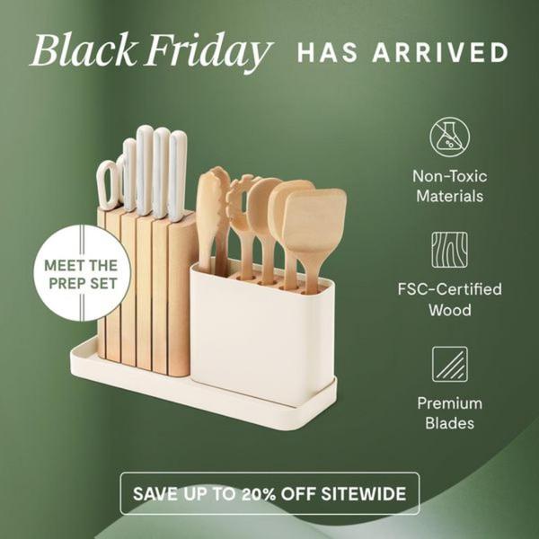
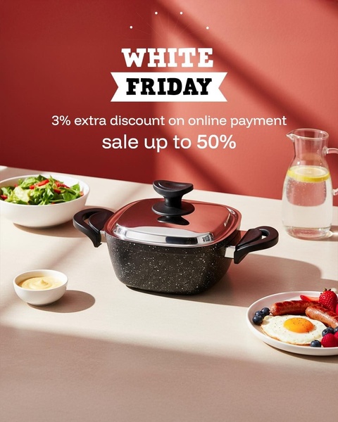
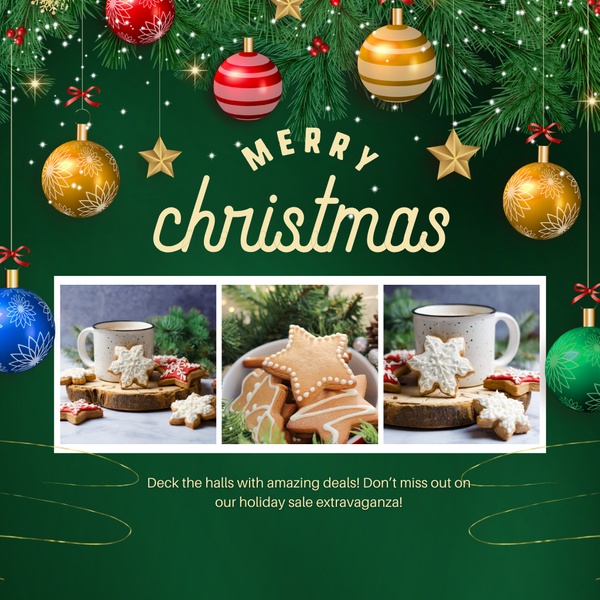
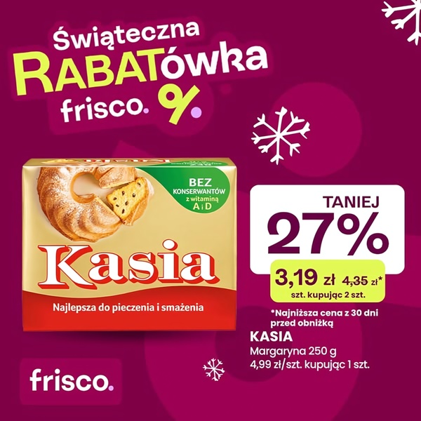





Promer helps you find the pattern, adapt it to your product, and create your own version in minutes.






