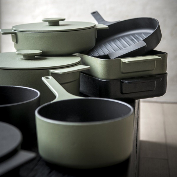
A clean, studio-lit display of stacked matte-finish cast iron pots and pans in sage green and black, emphasizing architectural design and premium quality.
Free credits included. No card required
This cast iron cookware ad creative leverages a clean, high-contrast visual strategy that prioritizes texture and color consistency to establish instant authority. By stacking the cookware pieces in a deliberate, architectural arrangement, the creative captures attention through simple, organized geometry that stands out amidst cluttered social feeds, signaling high-end utility without needing excessive text or secondary props.
This approach works because it allows the product quality to do the heavy lifting, a proven method for luxury or design-forward home goods. When you use Promer AI to analyze or replicate these visual hierarchies, you ensure your brand maintains a professional aesthetic that typically resonates with audiences looking for durability and style, regardless of your specific price point.
A premium product image doesn't need to shout to be seen; it just needs to be organized enough to be understood in a split second.
Pro tip
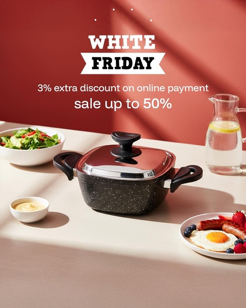
For cookware, use a monochromatic or complementary color palette in your background to make the product's finish pop. This avoids visual fatigue and allows the viewer to focus entirely on the design of the handles and lids.


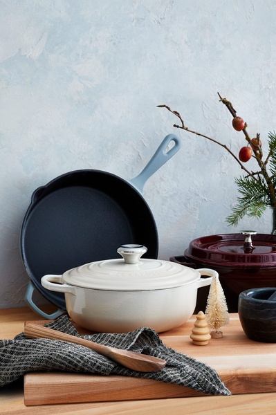





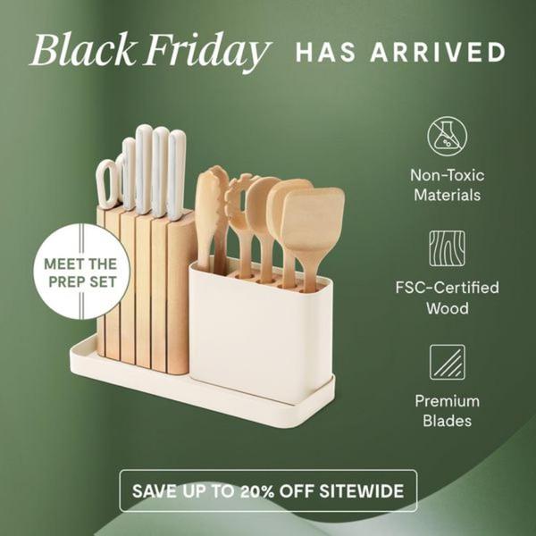
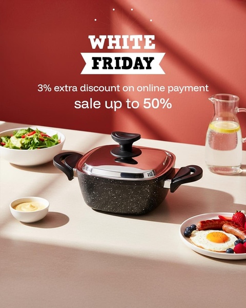







Promer helps you find the pattern, adapt it to your product, and create your own version in minutes.






