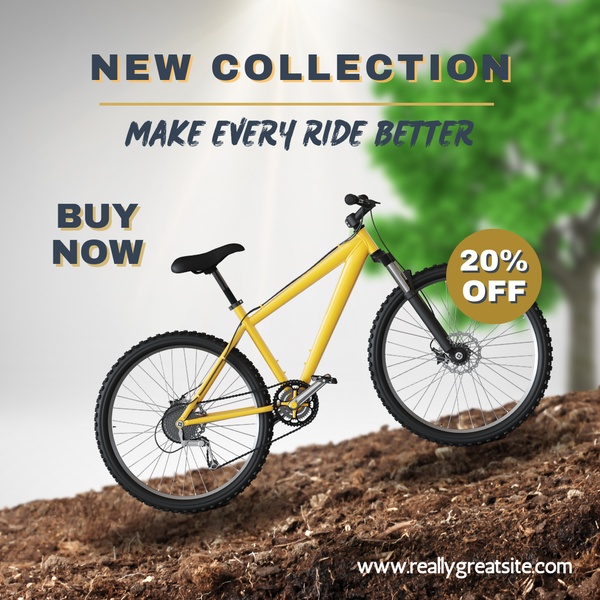
A clean, studio-lit mountain bike ad creative featuring a 20% discount badge and a clear call to action on a textured terrain background.
Free credits included. No card required
This mountain bike ad creative succeeds by pairing a high-contrast product image with a clear, direct incentive. By isolating the product against a neutral, terrain-inspired background, the visual strategy forces the viewer to focus entirely on the hardware and the discount badge. This minimalist framing reduces cognitive load, allowing the bold typography to communicate the value proposition immediately upon entry into the feed.
For most ecommerce teams, this structured approach is repeatable for any product category using Promer AI to maintain visual consistency. The ad works because it balances aspirational imagery with a functional, time-sensitive offer that bypasses creative fatigue through clean, uncluttered design. While results depend on audience targeting, a clear discount badge on a 1:1 image remains a stable anchor for mid-funnel retargeting.
A winning ad is built on the marriage of a high-clarity product shot and a no-nonsense offer that respects the user's split-second attention.
Pro tip
When using direct offer badges like this, ensure your primary product color complements the badge color to maintain a premium feel. Avoid overly busy backgrounds that distract from the main subject's silhouette, as the goal is to drive the eye immediately toward the bike and the discount.
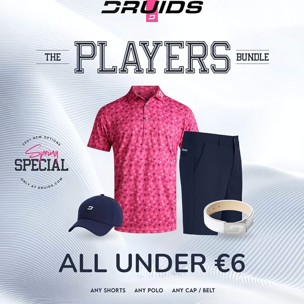
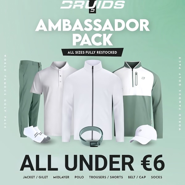
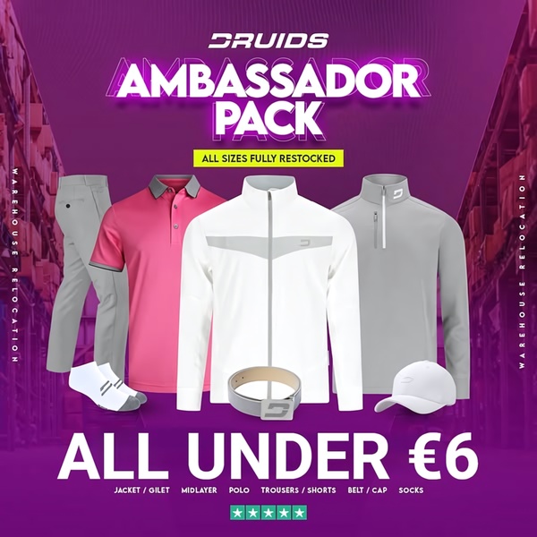






Promer helps you find the pattern, adapt it to your product, and create your own version in minutes.






