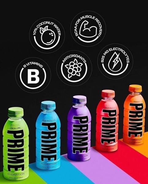
A clean, studio-lit grid featuring five colorful bottles of the product with icons highlighting key nutritional benefits.
Free credits included. No card required
This hydration drink creative succeeds by anchoring the product in an organized grid that pairs high-quality studio photography with clear, simplified benefit icons. By isolating specific value propositions like electrolytes and vitamins into clean circular badges against a stark black background, the design reduces cognitive load while highlighting product superiority.
For most ecommerce teams, this modular approach is highly effective because it allows for easy swapping of product variants while keeping the core messaging consistent. Using Promer AI, you can maintain this high-contrast structure to showcase your own product benefits, ensuring that your core unique selling points are the first thing a user sees while scrolling.
Great product photography becomes an educational asset when it maps clear, measurable benefits directly onto your brand aesthetic.
Pro tip
If your product has multiple variants, use this grid layout to showcase variety without creating visual clutter. Ensure your background color blocking aligns perfectly with the brand colors of each specific item to maintain a cohesive look across the entire display.
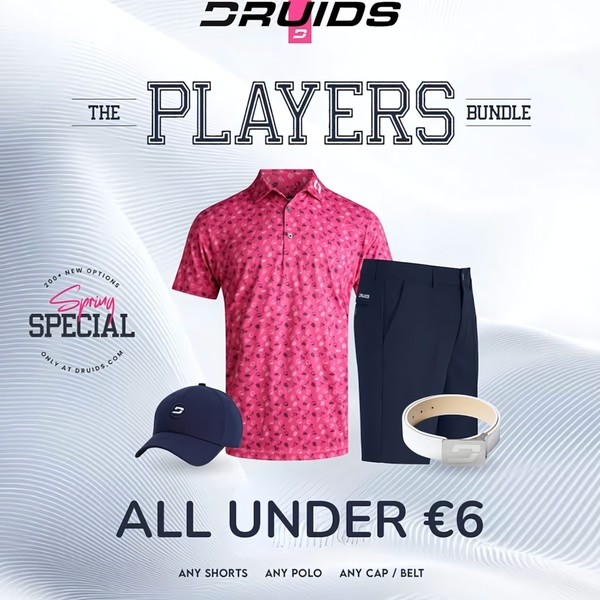
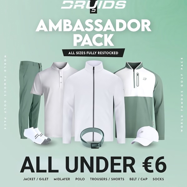
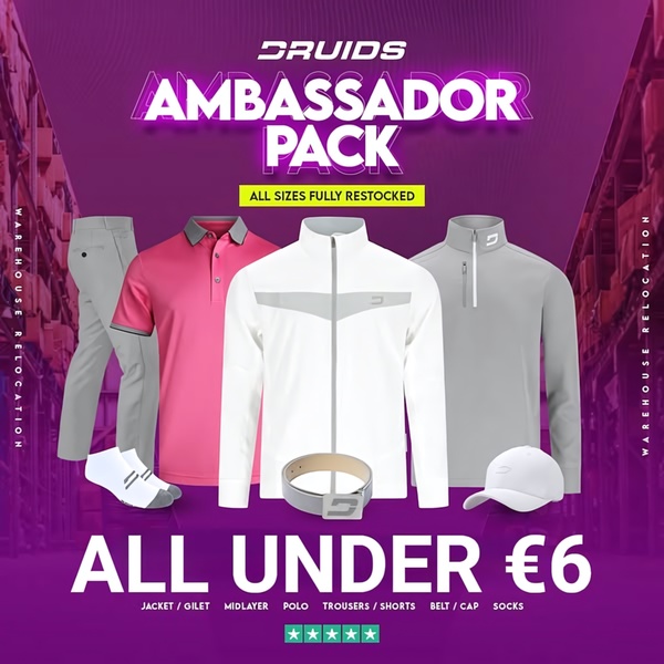




Promer helps you find the pattern, adapt it to your product, and create your own version in minutes.






