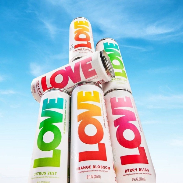
A vibrant, vertical stack of flavored electrolyte beverage cans set against a clear blue sky, emphasizing product variety and clean design.
Free credits included. No card required
This electrolyte beverage ad uses a bold vertical stacking technique to draw the eye upward, creating a clean and refreshing visual hierarchy that makes the product stand out instantly. The primary strength of this creative is its reliance on high-contrast color pops against a simple, bright background, ensuring the product brand name is front and center without cluttering the frame. By isolating the product against a sky-blue backdrop, the brand creates an aspirational, airy mood that perfectly aligns with a beverage centered on hydration and wellness. This approach from Promer AI leverages the psychological effect of symmetry and simplicity in product-first photography to drive immediate scroll-stop engagement in most ecommerce feeds. For brands with distinct, colorful packaging, this structural layout helps highlight variety without the need for complex surrounding props or excessive text overlays.
Great product imagery is defined by a clear structure that elevates the item into a hero, turning a simple package into a compelling visual statement.
Pro tip
When stacking products, ensure the primary brand name or key differentiator is consistently oriented toward the camera lens to maximize impact. Experiment with the angle of your stack to introduce subtle depth, as this creates a more dynamic, professional look than a flat two-dimensional arrangement.

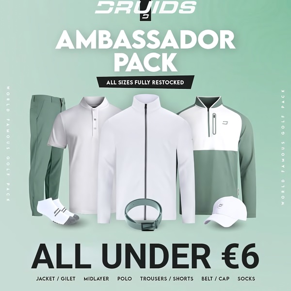
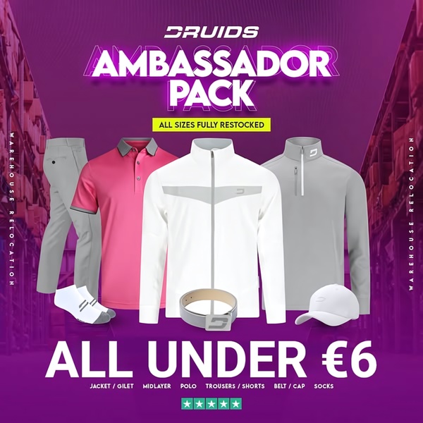



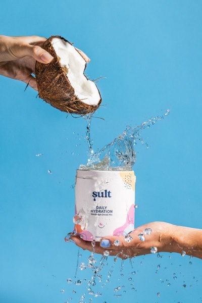






Promer helps you find the pattern, adapt it to your product, and create your own version in minutes.






