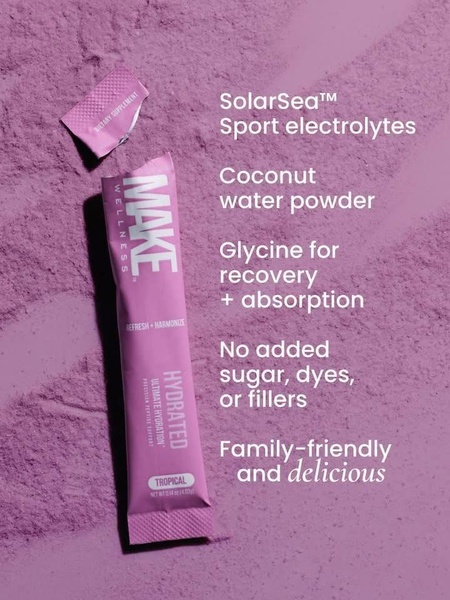
A top-down, clean product shot of an electrolyte powder stick on a matching purple powder background, highlighting ingredients and benefits with clear, accessible typography.
Free credits included. No card required
This electrolyte drink mix ad creative utilizes a minimalist, top-down visual approach to establish immediate trust and clarity. By pairing the physical product with a high-contrast powder background and bulleted benefits, the ad anchors the consumer's attention directly on the product's value proposition without unnecessary clutter. The core of this strategy is the direct, benefit-led communication that prioritizes readability and consumer transparency.
For most ecommerce teams, this pattern works because it removes friction between the scroll and the understanding of the product. Using Promer AI, you can replicate this clean, direct messaging structure for your own product catalog, ensuring that your USP is front and center. This approach is highly effective in saturated wellness categories where potential customers are looking for clear ingredient lists and simple utility.
Great ads start from an idea, a feeling, or a structure, not a blank design.
Pro tip
When using a monochromatic background, ensure your text contrast ratio is extremely high to maintain accessibility for mobile users. Consider using a subtle drop shadow or a semi-transparent text box if your background texture is too busy to keep the benefit list scannable.







Promer helps you find the pattern, adapt it to your product, and create your own version in minutes.






