.jpg)
A clean, studio-lit shot of a baseball cap featuring a 'Black Friday' tag, layered with bold 'Pre-Sale' typography and repetitive sale background text.
Free credits included. No card required
This baseball cap creative leans on a high-contrast typographic hierarchy to command attention in a crowded feed. By layering a bold, yellow 'Pre-Sale' headline over a clean, centered product shot, the design immediately communicates value and seasonal relevance without requiring complex animation. The combination of repeated background text and a specific, branded product tag creates a distinct visual anchor that forces a scroll-stop for users hunting for holiday deals.
For most ecommerce teams, this strategy works because it prioritizes clarity over clutter. Using Promer AI to replicate this structured approach allows you to test seasonal offers while maintaining a consistent brand aesthetic. Typically, focusing on a single, clear message supported by a high-quality product image performs better than busy, multi-product compositions, especially when targeting seasonal shoppers.
Great ads start from a clear structure that prioritizes the offer while keeping the product as the central hero.
Pro tip
When running seasonal sale ads, ensure your typography contrasts sharply with the background to maximize legibility on smaller mobile devices. You should also test variations with and without the repetitive text background to see if a cleaner or bolder aesthetic better captures your audience's attention.

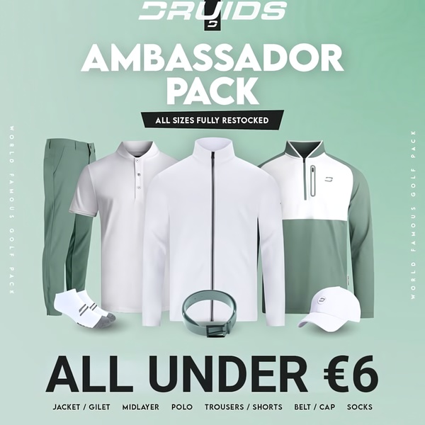
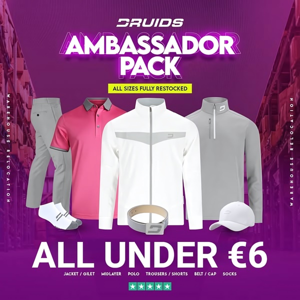
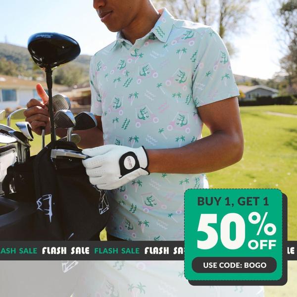


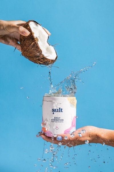



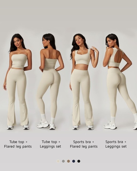

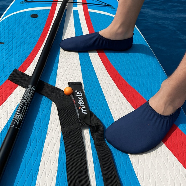


Promer helps you find the pattern, adapt it to your product, and create your own version in minutes.






