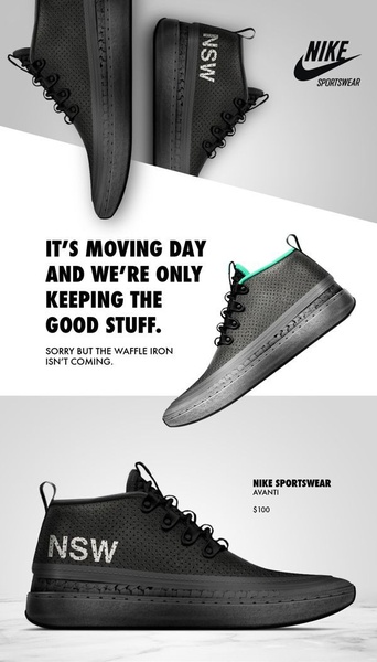
This ad creative uses a clean, split-screen design to highlight the texture and branding of a running shoe through high-contrast photography.
Free credits included. No card required
This running shoe ad creative succeeds by using a minimalist visual structure that directs the viewer's gaze immediately to the product details. The effectiveness of this ad stems from its clever juxtaposition of a relatable lifestyle hook with high-end, clean product photography. By stripping away visual clutter, the layout ensures that the brand identity and the product silhouette remain the primary focus throughout the experience.
For most ecommerce brands, this pattern works because it respects the user's intelligence by offering a witty, brief context before showcasing the product benefits. You can use Promer AI to analyze these layout dynamics, allowing your team to scale this minimalist aesthetic across your own product lines while maintaining consistent branding and clear focal points.
A minimalist approach allows your product to speak for itself when supported by a strong, singular narrative hook.
Pro tip
When using a minimalist hook like this, ensure your primary product subject occupies at least 40% of the screen. This creates a balanced composition that prevents the negative space from feeling empty, keeping the viewer anchored on your item.




















Promer helps you find the pattern, adapt it to your product, and create your own version in minutes.






