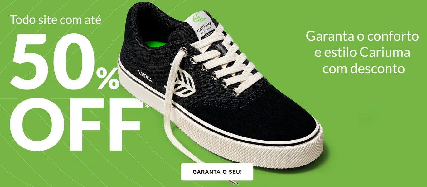
A high-impact 21:9 banner featuring a product-centric layout with bold white typography set against a vibrant green background to emphasize a limited-time discount.
Free credits included. No card required
This running shoe ad creative leverages a high-contrast visual hierarchy to force an immediate stop to the scroll. By isolating the product against a bold, solid-color background, the design ensures the viewer focuses solely on the footwear and the urgency of the discount. This direct, uncluttered approach reduces cognitive load for the user, making the value proposition feel both accessible and high-quality.
For most ecommerce teams, stripping away lifestyle imagery in favor of a clean, product-first look can significantly clarify the conversion path. Using Promer AI to maintain this level of visual consistency across your catalog helps anchor brand recognition while you test different discount levels. This pattern is particularly effective when the product aesthetic is minimalist, allowing the typography to act as the primary navigational element for the sale.
A winning ad structure relies on a single, undeniable visual anchor paired with a clear, benefit-led call to action.
Pro tip
When using bold, monochromatic backgrounds, choose a secondary color from your product's accents to create visual harmony. This connects the text call-to-action to the product itself, making the overall design feel like a cohesive, singular brand statement rather than a template.




















Promer helps you find the pattern, adapt it to your product, and create your own version in minutes.






