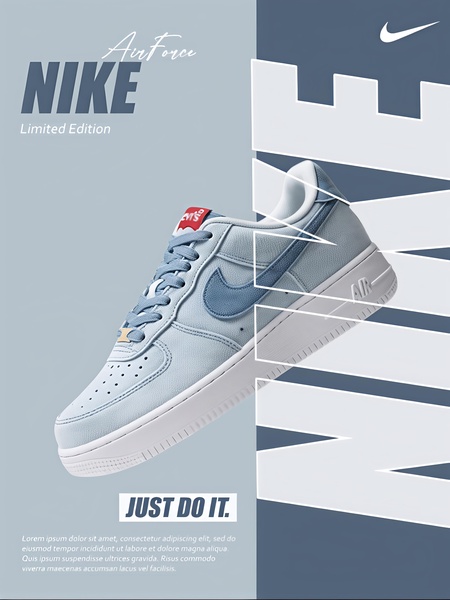
A clean, vertical 3:4 split-screen ad featuring a product-focused composition with dominant blue tones and bold typography.
Free credits included. No card required
This running shoe ad creative uses a high-contrast split-screen layout to force the viewer's eye directly to the product features. By masking the product partially with bold, oversized typography, the creative creates a sense of depth and exclusivity that separates the sneaker from standard product showcases. The core of this strategy is using negative space and typography as a structural frame for the item.
For most ecommerce brands, this pattern works because it removes visual clutter, allowing the consumer to focus entirely on the silhouette and design details. Using Promer AI to analyze or replicate this layout can help teams maintain brand consistency across diverse product catalogs while testing new visual hierarchy concepts.
A high-performing ad is built on a foundation of structural clarity, ensuring the product remains the undisputed protagonist of the frame.
Pro tip
When using typography as a graphical element in your ads, ensure the font scale does not obscure key product features like stitching or logo placement. Test your overlay transparency levels to find the sweet spot where the brand message is legible without distracting from the item itself.




















Promer helps you find the pattern, adapt it to your product, and create your own version in minutes.






