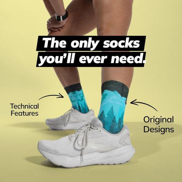
A clean, minimalist 1:1 ad creative highlighting technical sock features and unique design aesthetic through direct, bold typography.
Free credits included. No card required
This running socks ad creative utilizes a high-contrast, minimalist design to cut through feed clutter by positioning the product as the ultimate utility. By anchoring the bold, benefit-driven headline directly over the lower limbs, the layout immediately aligns the user's attention with the product’s core physical form and distinctive aesthetic design.
Such a clear, feature-forward pattern works well because it removes visual friction, allowing the viewer to instantly grasp the product's primary value proposition. Advertisers can replicate this clean structure using Promer AI to maintain high brand consistency while iterating on the headline's persuasive angle to test different audience pain points.
Great ads are built on a clear, single-minded promise that bridges the gap between what the product does and why the user needs it right now.
Pro tip
To increase the efficacy of a minimalist creative, rotate the 'technical features' labels to highlight different benefits in separate variants. This allows you to test whether your audience responds better to performance specs or design-centric comfort claims without changing the proven ad layout.




















Promer helps you find the pattern, adapt it to your product, and create your own version in minutes.






