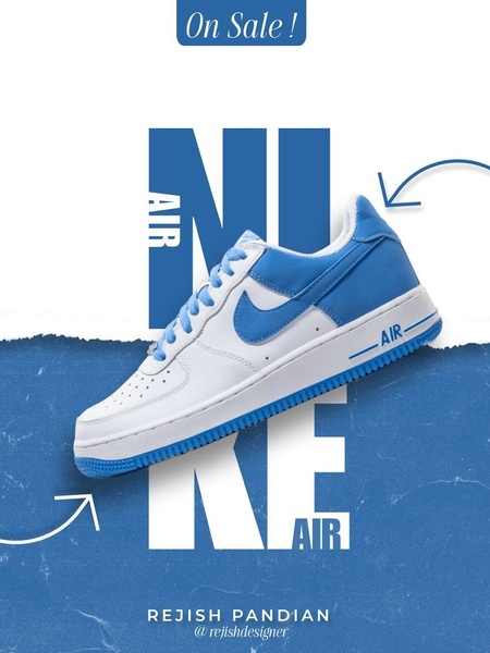
A clean, high-impact graphic design featuring a single running shoe set against bold, oversized typographic elements.
Free credits included. No card required
This running shoe ad creative succeeds by leveraging a heavy, typography-led composition that forces the eye to focus on both the product and the offer simultaneously. By using the product name as a massive visual frame behind the shoe, the ad creates a sophisticated sense of depth and authority that feels premium rather than purely promotional.
This pattern works because it declutters the creative space, allowing the unique silhouette of the footwear to stand out against a clean background. You can achieve this same high-conversion layout by using Promer AI to replace the branding and color palette while keeping the proven structural hierarchy intact for your own specific product line.
Great ads are built on clear visual hierarchies that guide the customer's eye exactly where you want them to look.
Pro tip
Use the negative space around your product to place your secondary offer or discount percentage. Keeping text away from the focal point of the product keeps the image from feeling cluttered.




















Promer helps you find the pattern, adapt it to your product, and create your own version in minutes.






