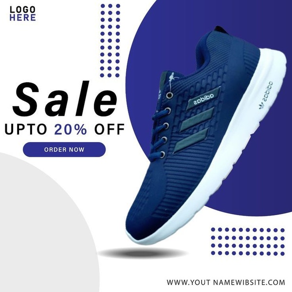
A square-format static ad featuring a single product focus with a bold sale offer and clear call-to-action button, utilizing a clean, modern aesthetic.
Free credits included. No card required
This running shoe ad creative succeeds by isolating the product within a high-contrast environment to ensure maximum focus on the offer. By combining a clean, minimalist aesthetic with a direct percentage-off hook, the design removes visual friction, allowing the user to immediately identify the benefit and the action required. The core strength of this layout is its use of negative space paired with structured, repeating geometric elements to draw the eye directly to the product and the discount.
For most ecommerce teams, this type of structured, distraction-free approach provides a reliable baseline for testing new offers. You can use Promer AI to replicate this exact compositional balance with your own inventory, ensuring your brand identity remains consistent across every asset while maintaining the clear, high-intent focus seen in this successful example.
Great ads start from a deliberate structural plan that puts the product at the center of the offer, not just a random design choice.
Pro tip
To increase the perceived value of a 20% off offer, try varying the saturation of your background colors in testing to see if higher contrast improves click-through rates. Ensure your button color contrasts sharply with both the background and the text to guide the eye toward the conversion point.




















Promer helps you find the pattern, adapt it to your product, and create your own version in minutes.






