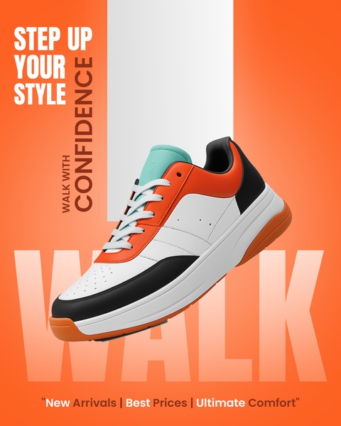
A high-impact ad featuring a modern sneaker against a vibrant orange background with bold, centered typography.
Free credits included. No card required
This running shoe ad creative leverages a high-contrast color palette and bold, direct messaging to capture immediate attention in a crowded feed. By layering assertive typography behind the product, the creative creates a sense of depth and authority that directs the viewer's gaze toward the sneaker's unique design details. This visual hierarchy ensures that the core value proposition is absorbed instantly while the product remains the focal point.
Applying this structured visual format allows ecommerce brands to signal confidence and quality without relying on cluttered imagery. For most teams, using Promer AI to standardize these high-conversion patterns helps eliminate creative fatigue across social channels. Consistency in branding, like the specific orange and white pairing shown here, typically reinforces brand recognition while maintaining a clean aesthetic for mobile viewers.
Great ads start from an idea, a feeling, or a structure, not a blank design.
Pro tip
When using bold typography behind a product, ensure your background color contrast ratio is high enough to maintain readability on small smartphone screens. Always test a version with slightly more whitespace if your product details get lost in the brand colors.




















Promer helps you find the pattern, adapt it to your product, and create your own version in minutes.






