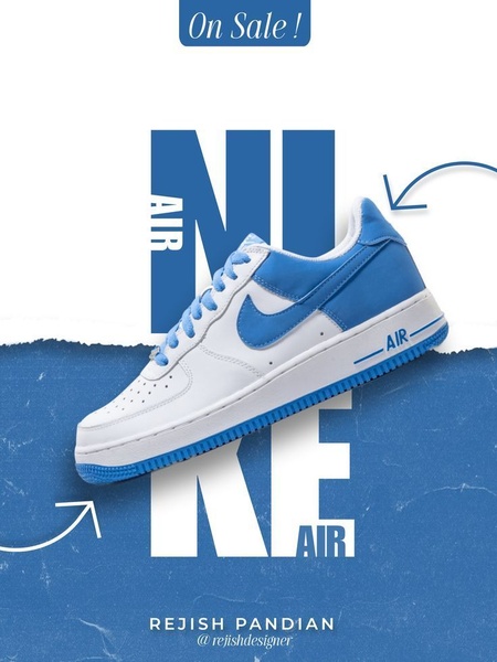
A clean, high-impact running shoe ad featuring bold brand typography, a 3:4 aspect ratio, and a clear 'On Sale' call-to-action for maximum visual focus.
Free credits included. No card required
This running shoe ad creative leverages a minimalist, typography-driven layout to draw immediate attention to the product. By placing the product over bold, oversized letters, the design uses visual hierarchy to force the viewer to focus entirely on the shoe while reinforcing brand recognition. The pattern prioritizes extreme clarity to minimize friction, ensuring the viewer understands the value proposition instantly.
For most ecommerce teams, this approach works because it eliminates background noise that often causes ad fatigue. Using Promer AI, you can emulate this structural focus, allowing your product to become the centerpiece through clean composition and strategic negative space. This strategy is most effective when the product itself has strong aesthetic appeal or a distinct color story.
Effective product ads rely on a clean visual hierarchy that places the item in its best possible light rather than burying it in complex design elements.
Pro tip
To maximize the impact of typographic overlays, ensure your product photo has a clean, solid, or desaturated background. This allows the text to pop and prevents the overall creative from feeling cluttered, keeping the focus entirely on the product silhouette.




















Promer helps you find the pattern, adapt it to your product, and create your own version in minutes.






