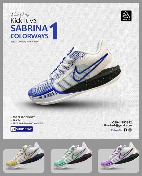
A clean, minimalist product display highlighting multiple colorway variations of a running shoe with clear call-to-action buttons.
Free credits included. No card required
This running shoe ad creative leverages a clean, high-contrast grid to present multiple product variations simultaneously. By placing the hero product at the center and secondary colorways below, the design reduces cognitive load while showcasing the depth of the collection. This structure allows potential customers to immediately compare options, driving higher engagement for performance-focused apparel brands.
Effective product-led advertising often relies on this clear, organized aesthetic to establish brand credibility and clarity. Using Promer AI, you can replicate this organized visual layout by swapping out existing products for your own inventory. This approach works well for most ecommerce teams aiming to scale their catalog exposure without overwhelming the user with cluttered, busy visuals.
Great ads start from a structured visual hierarchy that makes the product the hero of every interaction.
Pro tip
When using a grid-style layout, ensure the hero image is significantly larger than the secondary items to anchor the viewer's attention. Use high-quality studio shots with consistent lighting for all variations to prevent the creative from looking disjointed.




















Promer helps you find the pattern, adapt it to your product, and create your own version in minutes.






