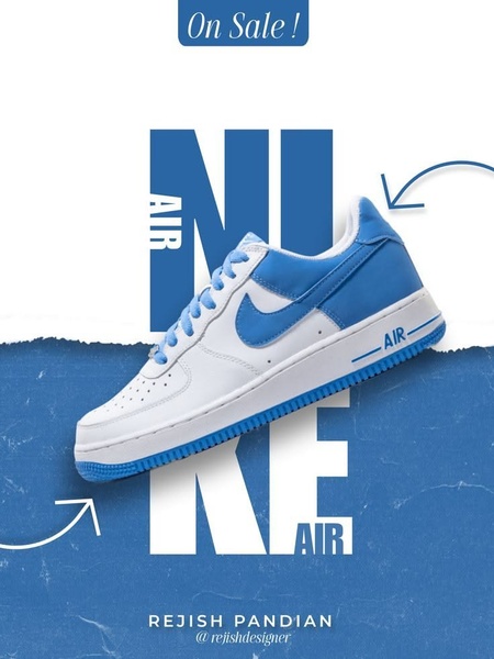
A clean, eye-catching ad featuring a Nike running shoe centered against bold blue and white typography, using a clear sale-driven aesthetic.
Free credits included. No card required
This running shoe ad creative leverages a clean, high-contrast visual hierarchy to make the product the immediate hero of the frame. By using large, overlapping typography to frame the footwear, the design forces the viewer's eye directly onto the product while using the "On Sale!" badge as a secondary, value-driven anchor. This approach works because it declutters the visual space, which is essential for catching attention on mobile feeds where complexity often leads to immediate scrolls. Utilizing Promer AI to replicate this structured layout allows brands to maintain this high-end aesthetic while ensuring the product always feels like the protagonist of the ad. When focusing on footwear, keeping the environment minimal ensures the specific silhouette and colorway remain the primary focus for potential buyers who are already in the market for new gear.
Great ads are built on a clear, repeatable structure that prioritizes the product above decorative elements.
Pro tip
When using a typographic hook like this, ensure your product is isolated on a clean background so the letters don't clash with the shoe's textures. Test variants where the text is placed both behind and in front of the product to see which orientation yields the best click-through rate for your specific audience.




















Promer helps you find the pattern, adapt it to your product, and create your own version in minutes.






