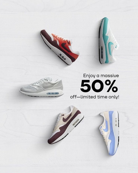
A clean, white-background grid display showcasing five different colorways of a running shoe with a clear 50% off sales announcement.
Free credits included. No card required
The effectiveness of this running shoe ad creative relies on a minimalist grid layout that removes all visual clutter to focus entirely on the product assortment and the discount value. By utilizing a high-contrast white background and balanced negative space, the ad creates an premium aesthetic that elevates the perceived value of the offer.
This pattern works because it builds an instant sense of urgency around a wide selection without overwhelming the user with distracting lifestyle elements. For most ecommerce teams, Promer AI provides a way to systematize this grid structure while maintaining brand-consistent color palettes for any product category.
A great ad creative acts as a functional map for the consumer, guiding their eye from the product range to the incentive in one clear, cohesive glance.
Pro tip
When using a grid layout, ensure your product shadows are uniform to maintain a floating, clean aesthetic. If your products have varied silhouettes, adjust their scale slightly to keep the overall composition balanced and avoid an uneven look.




















Promer helps you find the pattern, adapt it to your product, and create your own version in minutes.






