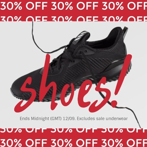
A square-format static ad featuring a black running shoe on a white background with bold red 30% off messaging and a clear expiration date.
Free credits included. No card required
This running shoe ad creative succeeds by stripping away visual clutter and focusing the user's attention entirely on the offer. By utilizing a high-contrast red and white palette with bold typography, the brand creates immediate visual urgency that stops the scroll. The placement of the product in the center serves as a neutral anchor for the aggressive discount messaging that frames the top and bottom of the square.
For most ecommerce teams, this minimalist approach works because it eliminates cognitive load, allowing the potential customer to process the value proposition instantly. You can leverage the Promer AI platform to analyze these structural patterns to ensure your own product creative remains focused on the primary hook without losing its brand identity.
Effective ad design is less about adding complex elements and more about removing everything that distracts from the offer.
Pro tip
When using a discount-heavy hook, ensure the expiration date is clearly legible to trigger FOMO. If your offer is evergreen, swap the date for a secondary benefit to maintain the same visual hierarchy without misleading the user.




















Promer helps you find the pattern, adapt it to your product, and create your own version in minutes.






