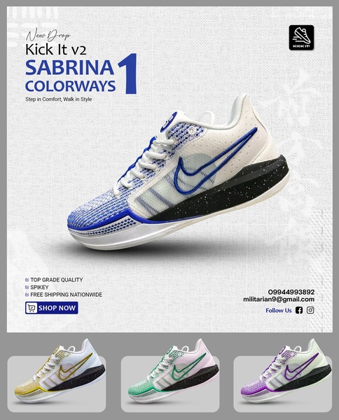
A 4:5 aspect ratio ad showing a hero product image with a three-variant colorway grid underneath, emphasizing product variety and clear call-to-action buttons.
Free credits included. No card required
This running shoe ad creative leverages a clean, high-contrast grid layout to emphasize product breadth while maintaining a singular focus on the primary hero model. By pairing a dominant hero image with a secondary row of variant colorways, the ad effectively communicates variety without cluttering the visual hierarchy. The core strategy here is to reduce decision friction by presenting a complete collection in one cohesive, easily scannable frame.
For most ecommerce teams, this structure works because it satisfies both the impulse of a new drop and the specific aesthetic needs of the target audience. Using Promer AI to standardize this layout ensures that your product variants are displayed with consistent lighting and framing, which is crucial for building trust in premium footwear. While results depend on your specific audience targeting, a grid-based approach typically helps viewers immediately identify if their preferred style is available.
A great product display creates a story of variety that makes the viewer feel like they are exploring a full catalog in a single glance.
Pro tip
When using a grid-style ad, ensure that the background texture on your hero image matches the secondary images exactly to create a seamless professional look. If the background colors conflict, use a clean studio backdrop to maintain visual harmony across the entire frame.




















Promer helps you find the pattern, adapt it to your product, and create your own version in minutes.






