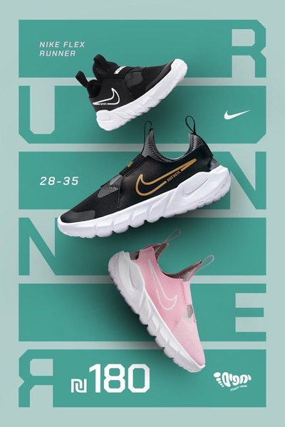
A clean, minimalist product hero layout showcasing three colorways of the Nike Flex Runner against a bold typography-driven background.
Free credits included. No card required
This running shoe ad creative leverages a structured visual hierarchy that positions the product as the primary focal point while utilizing the background as a subtle typography element. By stacking the footwear models vertically, the creative guides the viewer's eye downward, mirroring the natural scroll motion of social platforms while reinforcing the variety of options available to the consumer. This clean, distraction-free composition allows the core offer—the size range and pricing—to remain the clear secondary point of interest.
For most ecommerce teams, a product-first approach like this effectively removes cognitive load, letting the design communicate product utility instantly. When you use Promer AI to replicate this structure, you ensure that the negative space and typography remain balanced, which is vital when showcasing multiple product variations in a single static frame. By anchoring the design on a consistent brand color, the visual clarity remains high across both desktop and mobile feed placements.
Great ads start from a clear visual structure that anchors the product, making the value proposition feel like a natural part of the design rather than an intrusion.
Pro tip
When using a background-typography-heavy design, ensure your product shadows are consistent across all items to maintain a grounded, professional look. In most cases, light drop-shadows help separate the products from the text layer, which prevents the creative from feeling cluttered on small mobile screens.




















Promer helps you find the pattern, adapt it to your product, and create your own version in minutes.






