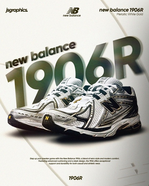
A high-contrast, professional product photograph featuring a metallic running shoe against a clean, architectural background.
Free credits included. No card required
This running shoe ad creative succeeds by utilizing a typography-driven hook that anchors the product within a premium, architectural frame. By placing the product name in massive, semi-transparent text behind the shoe, the brand creates a depth of field that immediately draws the eye to the metallic details of the footwear without distracting from the primary subject. The use of high-contrast metallic tones against a neutral background establishes a sense of luxury and performance that aligns with a high-end customer perception.
For most ecommerce teams, this approach works because it avoids the fatigue of over-crowded lifestyle imagery. By using Promer AI to analyze successful structures, marketers can replicate the balance of negative space and aggressive typography to highlight product features. This strategy is highly effective for footwear where the specific model name acts as a badge of status, though results will always vary depending on your specific target audience and brand positioning.
Great ads start from a clear visual hierarchy where the typography acts as a support system for the product, not a distraction from it.
Pro tip
When using large-scale typography, ensure your brand font maintains high readability even when semi-transparent. Pair this with a shadow effect on your product image to create a 3D illusion that makes the shoe pop off the screen.




















Promer helps you find the pattern, adapt it to your product, and create your own version in minutes.






